Follow for free plugins, new theme releases and theme news
Plugin Description
Adaptive Images
Resizes and optimizes images delivered to mobile devices, in a transparent way, so that the total download time is dramatically reduced. It works as a filter between your WordPress website and the devices and seves smaller images to them.
Note that this is not a CSS nor a responsive images solution. It does not affect your themes layout and style. It simply sends smaller images to the devices without them noticing it!
Fundamental goals
- Reduce the total download time of a web page in mobile devices dramatically.
- Work transparantly and unobtrusively by being independant of your theme layout and style.
- Be agnostic of the yet not-standardised
picture element or HTML the img srcset attribute.
Side benefits
- Respects search engines and sends them the orginal version of each image.
- If it does not recognise a device size it falls back to the original image size.
- It is lightweight, because it does not need to load the whole WordPress environment every time it server an image request.
Supported formats
- JPEG
- PNG
- GIF (not animated)
NOT Supported formats
CDN/Varnish/Nginx/external caching services
Since version 0.6.0 CDN/Varnish/external caching service support has been added as an option, in an experimental mode. This means: i) it is not thorougly tested yet ii) however, it works in almost all test cases so far iii) it bears no dangers to your installation iv) it adds a special url parameter to your image urls, so it is slightly obtrusive.
- Tested with MaxCDN, Varnish and Nginx up to now.
- Cannot handle CSS background images in this mode (yet).
Cannot work, not even in experimental mode, with CDNs which use a different subdomain for images, because these setups completely bypass WordPress when delivering images. Feel free to ask for details on this in the support forum.
Default breakpoints
- 1024px wide screens
- 640px wide screens
- 480px wide screens
Since version 0.5.0 and upwards it is configurable whether the plugin should take into account the landscape or the portrait orientation of each device. HiDPI (high device pixel density or retina) screens are supported too.
How to test
The esiest way to test is with your browser's device emulation mode (Responsive Design Mode) in it' Developer Tools. You can check this out this video https://www.youtube.com/watch?v=hCAC1XUUOvw/ as an example.
- Test with a tool like Webpagetest http://www.webpagetest.org/. Make sure you set the “Emulate Mobile Browser” setting in the “Advanced Settings” > “Chrome” tab.
- Test with an actual mobile device, a smartphone or tablet. Watch your website load in a snap.
- Check the
/wp-contents/cache directory to see the /adaptive-images directory and its contents. This is where the resized images are kept and cached by default.
- View an image straight from a browser and add a "?debug=true" at the end of the url like this "http://www.website.com/wp-content/uploads/2015/01/image.jpg?debug=true". This verifies that the plugin is working and should print useful debug information. If you keep seeing your image, then the plugin is not working as expected and the cause is probably a failure to update the .htaccess file properly.
- Add a "?debug=original" at the end of the url of an image and you will see the orginal version of the image even when a smaller version of it should have been shown.
Incompatibilities and issues
-
The plugin supports Nginx, if it is used as the main server, not as a caching server, but the server’s configuration file must be manually configured like this:
location / {

rewrite .(?:jpe?g|gif|png)$ /wp-content/plugins/adaptive-images/adaptive-images-script.php;

}
-
Windows IIS is not supported, but could be manually configured. Any IIS experts are welcome to contribute.
- Cannot work, not even in experimental mode, with CDNs which use a different subdomain for images.
- When using HTTPS/SSL make sure that you update all your website urls and also the urls in your WordPress General
settings page, otherwise the plugin will not be able to locate your images.
- WordPress Multisite (Mu) is not supported (some plans for future support are being discussed).
Stuff to keep in mind
- The plugin needs to add a little bit of code to your
.htaccess file in order to function properly. It removes this code once disabled. If you are not cool with that, then… tough luck!
- The plugin does not care whether the device is actually mobile or not. It checks the device screen resolution. If you have set your breakpoints big enough then it should work just as good for desktop devices as well. However, it targets mostly the mobile ones.
- The resized versions of the pictures are kept in a special directory in the
/wp-content/cache directory. This causes some storage overhead. It is up to you to judge whether this overhead is a sustainable option in your hosting environment. Usually it is not even remotely compared to the size of your original images directories.
- The plugin does not help with (nor hinder) art direction. Simple as that. Art direction https://usecases.responsiveimages.org/#art-direction in responsive images is an entirely different, yet important, problem. This plugin does not tackle with it. But it works in a supplementary way without interfering with other solutions that do. This means that you can combine it with any art direction solution.
Credits
- The plugin was originally based on the WP-Resolutions plugin https://github.com/JorgenHookham/WP-Resolutions/, but since version 0.3.0 it is a complete rewrite!
- Both plugins, WP-Resolutions and this one, have borrowed ideas from the Adaptive Images http://adaptive-images.com/ solution, specially adapted for WordPress.
- Many special thanks to my good friend and colleague Antonis Zachopoulos for the countless times that he provided feedback, ideas and debugging hints.
- Many thanks to @railgunner for the initial idea on the CDN/Varnish/external caching service feature in the plugin support forum. It showed the way that it was indeed possible!
- Thank you AJ at WpFASTER.org for being keen to test the above feature in a real environment.
- Thank you to the guys over at the Pressidium team for helping with debugging the CDN/Varnish/external caching service feature and providing test environments.
- Thank you Andy Gray for helping debugging the weird filesystem path issues in managed hosting environments.
- Thank you @milenoi2016 for helping sort out one of the many cases of WordPress directories setup.
- Thank you @minorgod for the Windows path fix.
- Thank you Mark Gruffer for the global request variable exposure hint.
- Thank you @timholz for the SameSite cookie hint.
- Thank you @blackcapdesign for spotting the regular expression issue in version 0.6.70 and helping debug it.
- Lastly, a million thanks to all of you who provided useful feedback in the early versions of the plugin, where the inevitable glitches, due to server environment variations, were more than a few.
Please, do let us know how the plugin works (or doesn’t work) for you. We love comments and creative feedback!
Screenshots

Plugin settings page in the admin area.
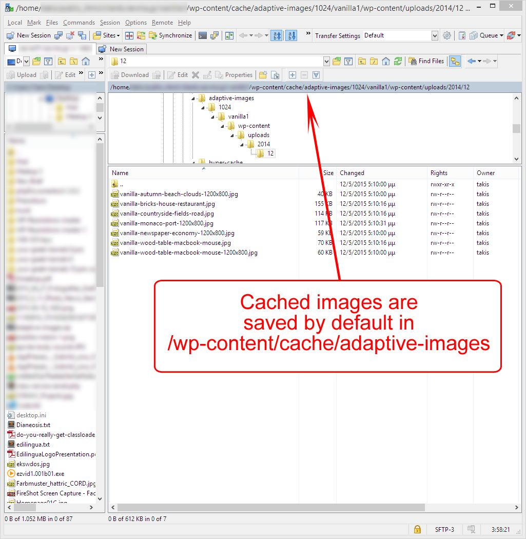
Resized versions of your images are cached by default in /wp-content/cache/adaptive-images.

Total web page load time is reduced dramatically on a mobile device (tested in http://webpagetest.org/).
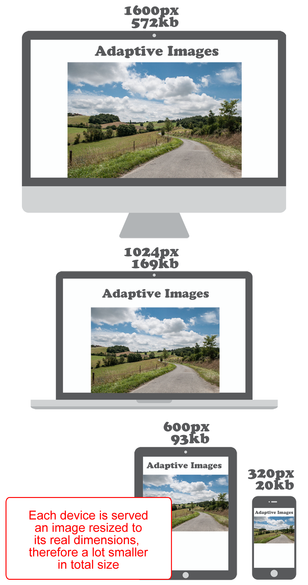
Each device is served an image resized its real dimensions, therefore a lot smaller in total size.
