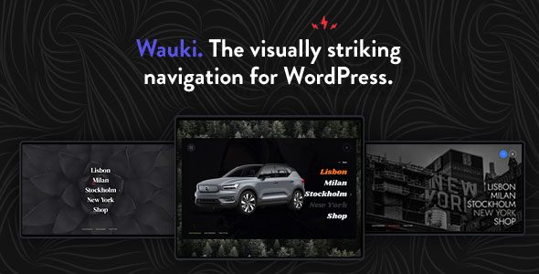
Wauki: Responsive WordPress Menu - Rating, Reviews, Demo & Download

Plugin Description
Introducing Wauki
Whether you’re looking to spice up your own personal or business website or you’re a developer looking for a time- and money-saving way to impress your client with a visually striking navigation, the Wauki plugin is the tool for the job.
Wauki is a super easy to set up, multi-level responsive menu plugin for WordPress. It works across devices big and small, can be added to any WordPress theme and can become a natural part of an existing website thanks to its substantial customization possibilities.
Combined with our quick response times, customer-praised support and dedication to continually update our products based on customer feedback, you can count on extracting more and more value from your purchase as time passes.
Features
Main menu button
- beautifully animated (animates into close button)
- fully color customizable
- freely alter roundness (display as circular, square or anything in between)
- position left/center/right of screen and fine tune top/sides positioning
- display above or below fullscreen menu
- add text label
- fixed/absolute positioning
- optionally hide
- use custom activator class to open the menu from any element on your website
Main menu
- multi-level menu
- change font size, item spacing, use theme font
- align left/center/right
- fully color customizable
- choose from different menu item hover effects
Search function
- align left/right (animation adjusts accordingly)
- fully color customizable
- optionally hide
Secondary close button
- fully color customizable
- optionally hide
Footer menu
- position left/center/right
- fully color customizable
Main menu background
- add background color and image (and change image opacity)
- customize width/height and horizontal/vertical distance from screen edges
Fullscreen background
- add background color and image (change opacities of both)
Styled scrollbar
- use optionally
- customize colors
Styled scrollbar
- set custom resolution at which design switches to mobile layout
- customize mobile layout separately from desktop:
- align menu items
- font size and item spacing
- footer menu align
Misc
- open on front page
- lock body scroll when menu open
- show to logged in users only
- show menu at specified resolution range only
- optionally hide theme menu by class/ID
Changelog
Update 1.1
- Added option to enter custom search field placeholder text
Quick update (no version change)
- Some JS script and translation string updates


