Flexible Spacer Block Wordpress Plugin - Rating, Reviews, Demo & Download

Plugin Description
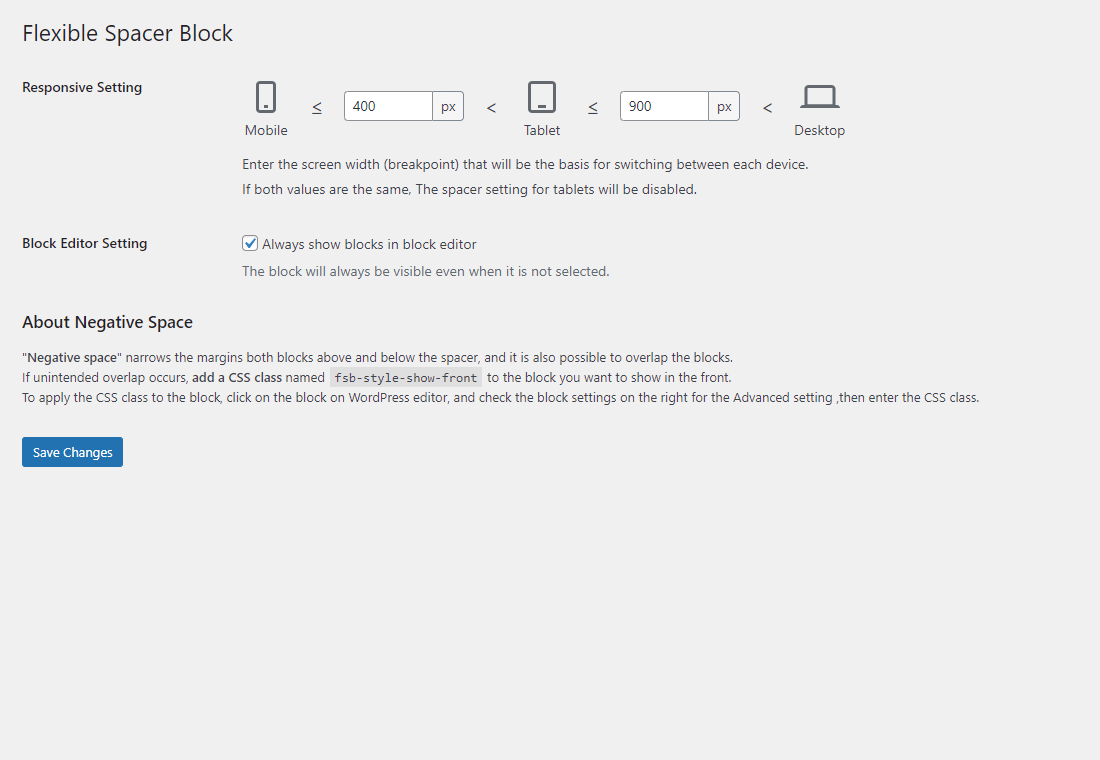
Flexible Spacer Block switches the height of the spacer according to the device screen width (breakpoints).
This block has two variable breakpoints, and you can adjust the height of the spacer for smartphones, tablets, and desktops respectively.
The height of the spacers can be changed individually or in batches.
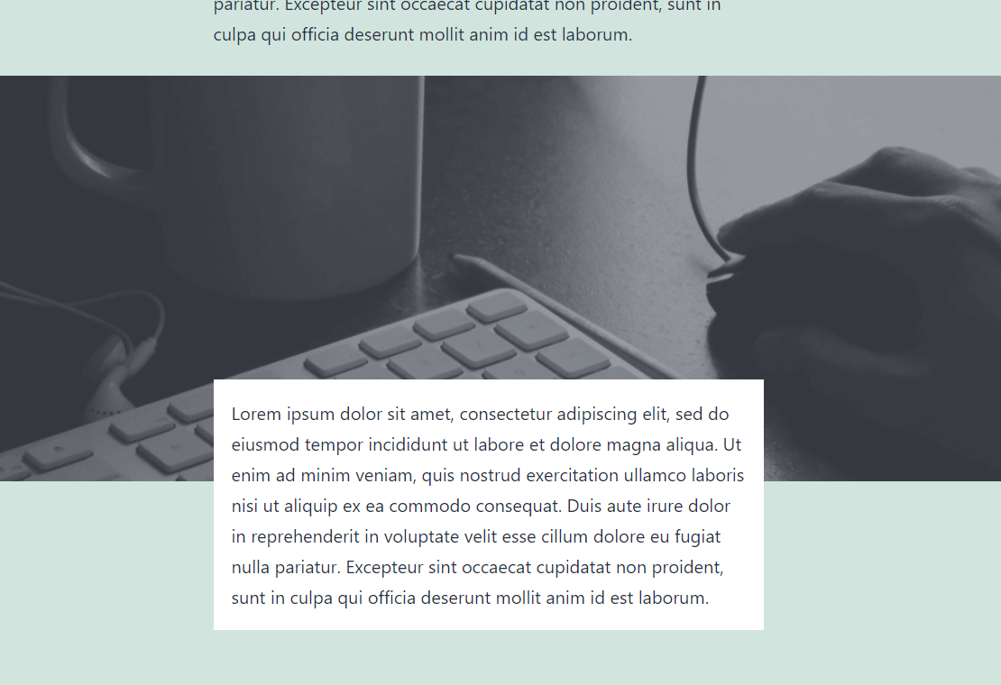
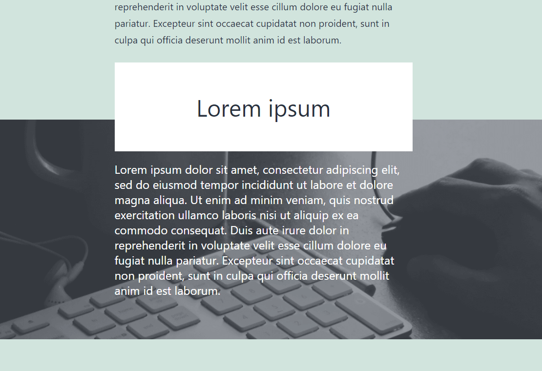
Also available to set “negative space (negative margin)” instead of the normal space.
And this block supports transform from and to core spacer block.
About negative space
“Negative space” narrows the margins both blocks above and below the spacer, and it is also possible to overlap the blocks.
If unintended overlap occurs, add a CSS class named “fsb-style-show-front” to the block you want to show in the front.
To apply the CSS class to the block, click on the block on WordPress editor, and check the block settings on the right for the Advanced setting ,then enter the CSS class.
Resources
Image for screenshot
License: CC0 Public Domain
Source: https://pxhere.com/ja/photo/245


