Morph: Flyout Mobile Menu Plugin for Wordpress - Rating, Reviews, Demo & Download
Plugin Description
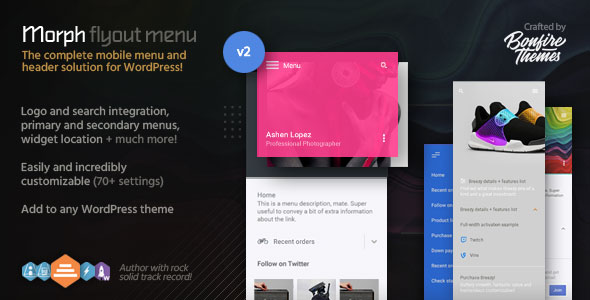
While designed primarily as a mobile menu, Morph works wonderfully on both desktop and touch devices and can be set to be shown at specified resolutions only, meaning – if you so wish – it can easily be used as a mobile-only or desktop-only menu.
Morph is also extremely easy to customize; by changing colors, enabling/disabling and modifying different elements, you can make sure your menu suits your site. It even supports widgets, making it that much more expandable. You can also slide it in from either the left or right side of the screen.
Furthermore, the flyout menu can be triggered by any element (a custom menu button for example). All you have to do is add a specific class to the element and voila! For cases such as this, Morph’s own menu button can be hidden with a single click.
To get a visual of what’s possible, be sure to have a look at the details below. And certainly don’t miss the live example here to see the menu in action. You can see more examples on the demo sites for one of our mobile themes here.
PS! Morph is available at a discount in the WordPress Mobile Menu Bundle.
It’s all in the details
Below, you’ll see the massive customizability of Morph brought out in detail. Every customizable element is displayed and explained in full. And remember, with the real-time Live Customizer integration, making changes as you see fit is effortless.
Header bar
The header bar holds Morph’s menu button and logo locations. Choose from multiple menu button styles and animations, add a menu button label, set up a logo, customize colors, opacity etc.
Have a look at the image below to get acquainted with all the possibilities:

Heading area
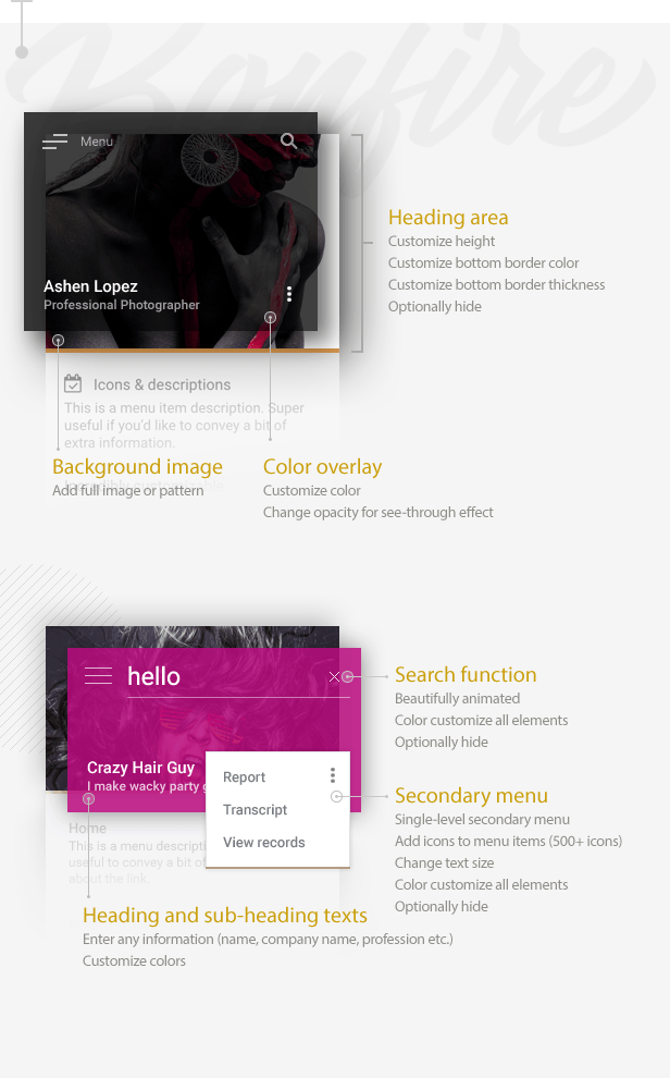
The heading area allows you to give some serious personality to your Morph flyout menu. Customize its height, overlay color and opacity, add a background image or pattern, insert heading and sub-heading texts with any information, and customize the color and thickness of its bottom border. You can also set up an optional secondary menu. Or you can hide the entire area and everything in it.
The image below lays out all the possibilities:
Multi-level accordion menu and widgets
The backbone of Morph is of course its flyout menu which, like everything else in the plugin, is immensely customizable; create a multi-level accordion menu, add icons and descriptions to menu items, change any and all colors. There’s even a widget location which allows you to wildly extend its uses; add a mailing list signup form, a call to action button, absolutely anything you need.
In addition, you can display Morph on specified resolutions only, there are options to hide your theme menu/logo/search etc. by IDs/classes when Morph is being displayed, and customize the color and opacity of the overlay which is displayed when the flyout menu is open.
Once more, please grab all the details from the image below:

70+ customizable settings
The easy-to-use Live Customizer lets you set up and modify Morph quickly and preview your changes in real-time. All the settings are logically categorized, organized and well explained, which means making changes and setting up Morph exactly as you want is an absolute breeze.

Features
- Super clean, beautifully animated design
- Highly customizable
- Morph uses the built-in WordPress menu builder and customization tools, making the plugin lightweight and allows you to use tools already familiar to you
- Slide in menu from either left or right side
- Choose from multiple menu button styles and animations
- Add label to menu button
- All buttons have regular and thin variations
- Add logo as text or upload logo image (retina support)
- Primary, multi-level accordion menu
- Add menu descriptions to multi-level menu
- Secondary pop-out menu (can be disabled)
- Integrated search function (can be disabled)
- Add heading background image or pattern, change image area height
- Set heading background overlay color and opacity
- Customize flyout speed and width
- Choose from 2 menu button animations (or disable animation)
- Menu button has fixed/absolute positioning
- Customize fancy scrollbar colors, thickness and roundness
- Show/hide Morph at set resolutions
- Hide your theme menu when Morph is active (via class/ID)
- Optionally disable retina and scrollbar scripts
- Optionally make the flyout always visible
Changelog
Quick update (no version change)
- Some JS script and translation string updates
UPDATE 2.3
- Added customization options for fancy scrollbar (customize colors, thickness, roundness)
UPDATE 2.2
- Added options to fine tune main and secondary menus' text sizes
UPDATE 2.1
- Redesigned the default menu button
- A menu button label can now be added (customize label text, color, hover color)
- Added option for thin button variations (applied to menu buttons, search buttons/field, submenu arrows)
- Updated retina.js inclusion
- Added option to disable retina support (useful if you're not using a logo image or not using retina images)
- Added option to disable the fancy scrollbar (useful if you prefer the browser's own scrollbar on desktop)
UPDATE 2.0
- Customization options are now located in the WordPress Live Customizer for convenient real-time editing
- Added logo location and a header bar
--- Use text or upload logo image (retina image support included)
--- Customize logo text color and hover color
--- Customize the header bar color and opacity (for see-through effect)
--- Optionally enable subtle shadow under the header bar
--- Logo position switches from left to right depending on chosen menu flyout position
--- Optionally hide logo and header bar

- Added option to hide your theme's menu, logo, search etc. via class/ID
- You can now set a custom speed for the flyout (useful to blend in perfectly with your theme's animations)

- Descriptions can now be added to menu items
--- Color customize descriptions separately from menu items

- Secondary menu now supports icons as well
- Accordion menu's sub-menu arrows now animate beautifully

- Added border below heading image
--- Customize color and thickness (optionally hide)

- You can now customize the width of the flyout menu (if set size is too large for mobile screens, it will automatically size down)
--- Added always-visible setting for the flyout menu
UPDATE 1.4
- Menu can now be positioned to appear from either the left or the right side
- Updated icon set to latest version
UPDATE 1.3
- Added option to use full top-level menu item (text + arrow icon) to open sub-menus, instead of just the arrow icon
UPDATE 1.2
- added two new menu button styles
- added option to control menu button animation speed
UPDATE 1.1
- Menu now supports the FontAwesome icon set (500+ icons available, please check updated documentation for instructions)
- Icons can be color customized separately from text-based menu items
- Also added an option to prevent FontAwesome from loading (in case your theme already uses this wildly popular icon set or you just don't want to use the icons in your menu)
Customers love Bonfire Themes!
As always, you can rely on our support should you need it. If you’re an existing customer and have spoken to us previously, then you already know what that means. If you’re a first time buyer, then here is just a taste of what our customers have to say about Bonfire Themes:
- “Great products, matched by great customer support.”
- “A customer service like that, I haven’t seen for a long time!”
- “I am one happy customer indeed! Thank you guys! Keep up the good work!”
- “This is by far the best support..”
- ”… extreme fast response!!!”
- “Thanks for your speedy service! :)”
- “Best support I’ve ever seen! .. Five stars is not enough!”
- “Wow, thanks for the prompt response.”
- ”… customer service provided goes above and beyond … An excellent experience from start to finish.”
- “Thanks for such a speedy response! You rock man!”
Psst! Looking for an entire mobile theme, not just a menu?
We have the highest-rated mobile themes on ThemeForest!


