Nexus Theme Builder For Elementor Wordpress Plugin - Rating, Reviews, Demo & Download
Plugin Description
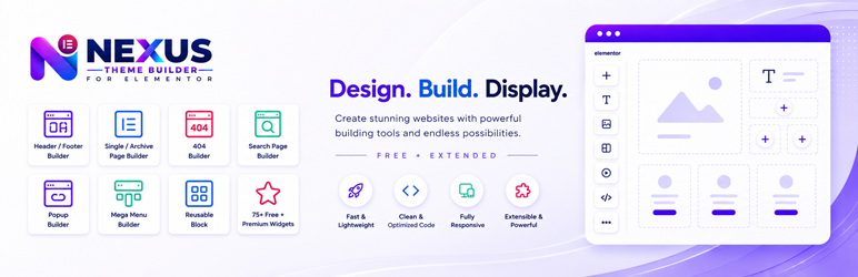
Nexus Theme Builder for Elementor lets you build Elementor headers, footers, single templates, archives, search results, 404 pages, and reusable blocks with display conditions. Elementor is required; Elementor Pro is not required for the Free Theme Builder features.
The free plugin also includes a focused Elementor widget library and a dashboard where individual widgets can be enabled or disabled. WooCommerce-dependent widgets are registered only when WooCommerce is active.
An optional Pro extension is distributed separately and is not bundled or artificially locked inside this free WordPress.org package.
Free Theme Builder
The Free Theme Builder lets you design site templates with Elementor and control where each published template is used. Templates are created and managed from the Nexus Builder area in the WordPress admin.
Free template types
The Free edition supports the following template types:
- Header — build a custom Elementor header and assign it to the entire site or selected locations.
- Footer — build a custom Elementor footer and assign it globally or conditionally.
- Single content templates — create Elementor layouts for posts and supported public custom post types.
- Archive — design archive layouts for supported WordPress archive contexts.
- Search Results Page — create an Elementor template for WordPress search-result pages.
- 404 Page — replace the normal theme 404 output with an Elementor-designed template.
- Custom Block — build reusable Elementor content that can be inserted where supported, including through the Nexus template shortcode.
The Theme Builder works with supported public post types and public taxonomies when they meet the plugin’s targetable-content requirements. This allows compatible third-party content types to participate without hard-coding every post type into the plugin.
Display conditions and template assignment
Every supported Theme Builder template can use assignment rules so a design appears only where it is intended.
Display Location
Display Location defines where a template is eligible to appear. Depending on the template type and available WordPress content, locations can include:
- Entire site.
- Singular content.
- Posts and supported public post types.
- Specific pages, posts, or supported custom content.
- Front page.
- Posts page.
- Archives.
- Author archives.
- Date archives.
- Public taxonomy archives and supported taxonomy terms.
- Search results.
- 404 context.
Exclude Location
Exclude Location creates exceptions to a broader Display Location rule. For example, a Header can target the entire site and exclude one landing page, or a Single template can target a post type while excluding selected content.
When a matching exclusion rule exists, the exclusion takes precedence over the matching display rule.
User Roles
Templates can also be restricted according to the current visitor. Supported choices include:
- All users.
- Logged-in users.
- Logged-out visitors.
- Individual WordPress roles available on the site.
This is useful for role-aware headers, account experiences, member areas, or layouts that should differ for signed-in and signed-out visitors.
Priority
Priority resolves situations where more than one published template matches the same visitor and location. When multiple eligible templates match, the template with the lowest Priority number wins.
This makes it possible to create a broad site-wide template and then create more specific templates that intentionally take precedence.
Custom Blocks and template shortcode
Published Nexus templates can be rendered through the template shortcode where shortcode output is appropriate:
[netb_template id="123"]
Replace 123 with the WordPress post ID of the published Nexus template you want to display.
Custom Blocks are useful for reusable sections, calls to action, information panels, promotional sections, or other Elementor-built content that should be maintained in one place and reused elsewhere.
Widget management
The Nexus Builder > Dashboard provides widget management for the Nexus widget library.
Free widgets can be enabled or disabled from the dashboard. A disabled widget is not registered with Elementor, helping site administrators keep the Elementor widget panel focused on the components they actually use.
Widget frontend assets are loaded according to the plugin’s widget/dependency logic rather than treating every optional feature as permanently active. WooCommerce-dependent widgets are registered only when WooCommerce is available.
Free Elementor widgets
The Free edition includes the following Elementor widgets.
1. Site Logo
Displays the WordPress site logo inside Elementor layouts and Theme Builder templates. It is intended for custom headers, footers, navigation areas, and branded site sections where the active site identity should be used dynamically instead of uploading the same logo repeatedly.
2. Page Title
Displays a context-aware page or content title. This is useful in single templates, archive layouts, search/404 structures, and page-title sections where the displayed heading needs to follow the current WordPress request instead of using fixed text.
3. Site Tagline
Displays the site’s configured WordPress tagline dynamically. Use it in headers, footers, branding sections, or template layouts where the Site Tagline should remain synchronized with the value configured in WordPress.
4. Site Title
Displays the WordPress Site Title dynamically. It is useful as a text-based brand identity, as a companion to the Site Logo, or in templates where the site name should update automatically when changed in WordPress settings.
5. Post Meta Info
Displays post-related metadata for the current content. It is designed for single-content templates where contextual post information needs to be shown without manually recreating it for every post.
6. Breadcrumbs
Outputs breadcrumb navigation based on the current WordPress context. It is intended to help visitors understand the current content hierarchy and provide contextual navigation within Theme Builder layouts.
7. Copyright
Provides a dedicated copyright element for footer and site-information layouts. It keeps copyright presentation inside Elementor so footer content can be designed consistently with the rest of the template.
8. Reading Time Count
Calculates and displays an estimated reading-time value for applicable content. It is useful in posts, articles, editorial templates, and other content layouts where visitors benefit from knowing the approximate reading time.
9. Search
Creates a configurable Elementor search interface. The widget supports layout/design choices, placeholder text, selectable search content types, input and toggle icons, optional search buttons, alignment controls, and live-search behavior.
Live Search can be enabled with a configurable minimum-character threshold so results are requested only after the visitor enters enough search text. The widget is suitable for headers, utility bars, search sections, and dedicated search experiences.
10. Counter
Creates numerical counters that can use either manually configured values or supported dynamic count sources. Controls include start/end numbers, labels, number adjustment, post type/status sources, user-role counts, comment counts, alignment, HTML tag selection, and optional icon or image presentation.
Use the Counter for site statistics, content totals, user/community metrics, milestone sections, or visually highlighted numbers.
11. Info Card
Creates structured information or feature cards with configurable layout and predefined design options. Content controls include icon support, badge text, title, description, call-to-action text/link, CTA icons, icon position, alignment, and full-width button behavior.
It is suitable for feature lists, service summaries, benefit cards, resource links, and call-to-action sections.
12. Social Share
Provides configurable social-sharing buttons for Elementor layouts. Individual share items can define the network, custom label, icon, custom share URL, copied-link message, and brand color.
The widget also provides layout/design controls such as predefined designs, button views/styles, label visibility, and share title/text configuration. It is useful in single-post templates, article layouts, landing pages, and share-focused content sections.
13. Static/Dynamic Table
Builds tables from multiple supported data sources. Manual tables can define column headings and row cells directly in Elementor, while dynamic configurations can query supported WordPress content.
Query-related controls include post type, query limit, offset, included/excluded posts, taxonomy selection, and term selection. The widget also supports heading/title presentation and predefined table designs. Where supported by the widget configuration, external CSV data can be retrieved as data through WordPress’s safe HTTP API with validation and bounded processing.
Use this widget for comparison data, schedules, directories, content tables, structured records, or dynamically generated WordPress content tables.
14. Interactive Card
Creates visually interactive cards with configurable content, layouts, interaction modes, predefined designs, image support, and image/media effects.
Effect controls include size and color options, secondary colors, wave amplitude/density/speed/direction, positioning, and optional layered effects. It is intended for visually engaging feature cards, showcases, service blocks, portfolio elements, and promotional sections.
15. Animated Heading
Creates animated text headings made from an optional prefix, one or more animated words, and an optional suffix. Controls include animation selection, hold and transition timing, typing speed, looping, pause-on-hover behavior, HTML heading tag, alignment, and animated-word decoration.
Use it for hero areas, feature introductions, rotating messages, product/value propositions, or headings that need controlled text animation without manually writing animation code.
16. Logo Grid
Displays logos in a responsive grid. Each logo item can include an image, brand name, description, website URL, and tooltip information.
Layout controls include column count, spacing, equal-height behavior, content visibility/position, image effects, and predefined designs. It is suitable for client logos, technology partners, integrations, sponsors, certifications, and brand showcases.
17. Animated Link
Creates a styled link with selectable animation behavior. Controls include link text, destination URL, accessible label, optional icon, icon placement, layout/design presets, animation style, alignment, width, hover motion, magnetic strength, duration, easing, and effect thickness.
It is useful for navigation accents, calls to action, text links, footer links, and interactive content where a standard link needs a more deliberate visual treatment.
18. Navbar
Builds a responsive navigation/header component using a selected WordPress menu. The widget can include branding, a custom logo, brand text/link, search controls, and an optional action button with icon positioning.
Layout controls include predefined designs, header layout, action ordering, and content width. It is intended for Elementor-built headers and navigation sections where menu, branding, search, and a primary action need to work together in a single configurable widget.
19. Advanced Progress Bar
Creates one or more progress items with labels, numeric values, displayed values, and optional icons. Each item can use its own progress and track presentation while widget-level settings control layout, design presets, columns, and label/value/icon visibility.
Use it for skills, completion metrics, service indicators, project progress, process visualization, or percentage-based information.
20. Post Grid
Displays queried WordPress content in configurable grid layouts. Controls include layout style, design preset, columns, column/row gaps, equal-height cards, clickable-card behavior, post type, posts per page, include/exclude lists, taxonomy and term queries, child-term handling, offset, and ordering.
It is useful for blog indexes, related-content areas, resource libraries, news grids, portfolio-like post displays, and supported custom post type listings.
21. WooCommerce Categories
Available when WooCommerce is active. This widget displays WooCommerce product categories using configurable grid/display layouts.
Controls include design presets, columns and spacing, category source, selected categories, parent-category filtering, excluded categories, maximum category count, hide-empty behavior, sorting, category images, and missing-image handling.
Use it for shop navigation, category landing pages, product discovery sections, and WooCommerce home/shop layouts.
OPTIONAL EXTENDED / PRO EDITION
Nexus Theme Builder for Elementor Pro is a separate extension. It requires the Free plugin and extends the existing Nexus Builder architecture rather than replacing it.
The following information is provided so users can clearly understand what belongs to the optional extension. These Pro widgets and features are not included as locked executable functionality inside the Free WordPress.org package.
Pro Theme Builder extension
Mega Menu template type
When the Pro extension is active and its Mega Menu functionality is available, Pro registers the dedicated Mega Menu Theme Builder template type. This allows Elementor-built Mega Menu content to be maintained as a Nexus template and used by the Pro Mega Menu system without exposing a disabled premium template type in the Free edition.
Popup Builder template type
The Pro extension registers a dedicated Popup Builder template type. Popup layouts are designed with Elementor and reuse the existing Display Location, Exclude Location, and User Role assignment system. Pro adds page-load, delay, and exit-intent triggers together with visit-frequency controls for every visit, first visit, after a configured number of visits, or once per session.
Pro Elementor widgets
1. Advanced Button
Creates enhanced buttons with primary and secondary text, configurable links and IDs, alignment, icons, icon placement/gap, badges, button sizes, design presets, and hover effects. It is intended for conversion-focused calls to action and more expressive button treatments than a basic button element.
2. Advanced Heading
Builds headings from subtitle content, optional subtitle icons, text before/after a highlighted segment, selectable HTML tags, links, optional background text, alignment, subtitle positioning, decoration, hover effects, and design presets.
3. Advanced Icon Box
Creates feature/information boxes with icon or image media, full-width image options, image masking, subtitle, title, description, separators, read-more actions, icons, links, link-entire-box behavior, and badges.
4. Advanced Image Gallery
Creates advanced galleries from selected images with configurable caption sources and link behavior. Layout controls include columns, gaps, image heights, featured-item frequency, navigation arrows, pagination dots, autoplay timing, looping, image masks, and entrance animation.
5. Cart
Adds WooCommerce cart information to Elementor layouts. It supports configurable cart icon presentation, empty-total text, alignment, spacing, padding/margins, text/background/border styling, hover states, icon sizing, and box styling. WooCommerce is required.
6. Charts
Displays structured values as visual charts. Controls include chart type, predefined designs, heading/title/subtitle visibility, manual data, labels, dataset names and values, primary/secondary colors, border or line width, fill behavior, and multiple dataset configuration where supported.
7. Comparison List
Builds structured comparisons for plans, products, services, or features. It supports feature-column headings, multiple comparison columns, plan titles, supporting text, price/labels, buttons and links, highlighted columns, badges, feature rows, descriptions, and per-column values.
8. Countdown Timer
Creates countdown experiences using supported timer modes such as a fixed due date or configured duration. Controls include duration values, persistence, daily end time, restart/loop behavior, visible units and labels, separators, columns, design presets, and item spacing.
9. Dynamic Content
Queries and displays WordPress content using multiple presentation modes. The widget includes layout/design presets, grid/list-style configuration, columns and spacing, equal-height behavior, carousel/navigation options where applicable, post type, item count, offset, include/exclude controls, and dynamic WordPress query settings.
10. FAQ
Creates FAQ interfaces from manually entered items or supported WordPress content. Controls include questions and answers, open-by-default behavior, post-type sourcing, item count, answer source/word limits, sorting, empty messages, layouts, columns, and initial-open behavior.
11. Logo Carousel
Displays brand/client logos as a carousel. Logo items can include image, brand name, description, website URL, tooltip, and tooltip positioning. Carousel controls include design preset, visible content, slide style, equal-height slides, slides per view, spacing, center mode, and partial next-slide preview.
12. Mega Menu
Provides the Pro navigation widget for advanced menu structures. It can use a WordPress menu or configured menu items and supports item titles, keys/parent relationships, links, icons, descriptions, badges, empty states, menu alignment/direction, desktop open triggers, and responsive/mobile behavior.
The Mega Menu widget works with the Pro-owned Mega Menu Theme Builder template type and its menu-related integration.
13. Offcanvas
Creates slide-in/offcanvas panels triggered by a button, icon, or external CSS selector. Panel content can come from supported content sources including editor content, sidebars, Elementor templates, or shortcodes. Controls include panel title, position, animation, width, alignment, trigger configuration, and empty-state handling.
14. Post Gallery
Displays posts or supported content in image-led gallery layouts. It includes design presets, gallery layout choices, columns/gaps, tile or mosaic sizing, image presentation settings, post type, item count, include/exclude controls, and taxonomy/term queries.
15. Post List
Creates flexible post lists with layout, columns, spacing, image position, vertical alignment, text alignment, linked featured images, missing-image placeholders, title tag selection, excerpt length, date display, relative-time support, read-more controls, and advanced query options.
<
h3>16. Post …
Screenshots

Nexus Builder Dashboard and Free widget management.

Theme Builder template list and template creation workflow.

Template Type, Priority, Display Location, Exclude Location, and User Role controls.

Elementor editing with Nexus Theme Builder templates.

Nexus Elements category inside the Elementor widget panel.

Free display widgets such as Site Logo, Page Title, Breadcrumbs, Post Meta Info, and Reading Time Count.

Free content widgets such as Search, Counter, Info Card, Table, Animated Heading, and Interactive Card.

Free layout/content widgets such as Navbar, Post Grid, Logo Grid, Advanced Progress Bar, and WooCommerce Categories.