Replai Mega Menu – Multi-column Dropdown Menus Wordpress Plugin - Rating, Reviews, Demo & Download

Plugin Description
Replai Mega Menu upgrades the menus you already build in Appearance Menus into modern, responsive mega menus — no page builder required. Enable a mega panel on any top-level item and design its dropdown with columns, section headings, per-item icons and badges, a featured card and CTA buttons. On phones everything turns into a clean off-canvas drawer.
Because it is built on the native WordPress menu system, it stays compatible with your theme and multilingual plugins, and if you deactivate it your menus keep working as plain menus.
What you can build
- Multi-column panels — organize a dropdown into columns with uppercase section headings, just like the big SaaS sites. Split into real columns automatically or add your own column breaks.
- A real icon library — pick a per-item icon from a searchable library: Font Awesome (Solid & Brands, bundled locally), Dashicons and emoji. Set each icon’s color, and its size on an XS–XL scale.
- Badges — add a small label such as “NEW” to any item, with a custom color.
- Featured cards — a highlighted block with image, title, description and link inside the panel.
- CTA buttons — turn a top-level item or a sub-item into a call-to-action button.
- Responsive off-canvas drawer — below your chosen breakpoint the menu becomes a full-height mobile drawer with smooth accordions, a header with your logo, a sticky CTA area and a close button. Choose which side it opens from and hide your theme’s own toggler so there’s only one hamburger.
- Fine-tuned styling with a live preview — accent, text and background colors, panel corner radius, dropdown arrow style (chevron / triangle / plus-minus / none), open-on-hover or open-on-click, and XS–XL scales for item spacing, font size and weight, icon size and sub-item title/subtitle — each with a separate mobile value. A live Desktop/Mobile preview reflects your changes as you type.
- Works with your stack — built on native Appearance Menus, placeable with a shortcode, and available as an Elementor widget. No theme lock-in.
How to use it
- Go to Appearance Menus and edit any item. You will see a new “Mega menu (Replai)” section with the options above.
- Go to Appearance Replai Mega Menu to set colors, the mobile breakpoint and which theme menu locations the plugin should render as mega menus.
- Or drop it anywhere with the shortcode
[replai_menu location="primary"](or[replai_menu menu="Main Menu"]). - Building your header with Elementor? Look for the Replai Mega Menu widget and pick a menu or theme location right in the editor.
Screenshots

A multi-column mega panel on the front end, with per-item icons and subtitles laid out across columns.
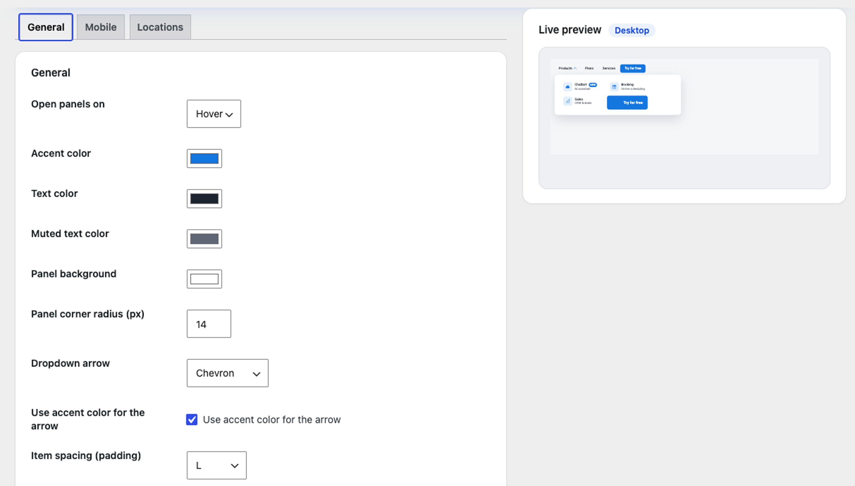
The settings screen (General tab): accent and text colours, panel corner radius, dropdown arrow and the live desktop preview.
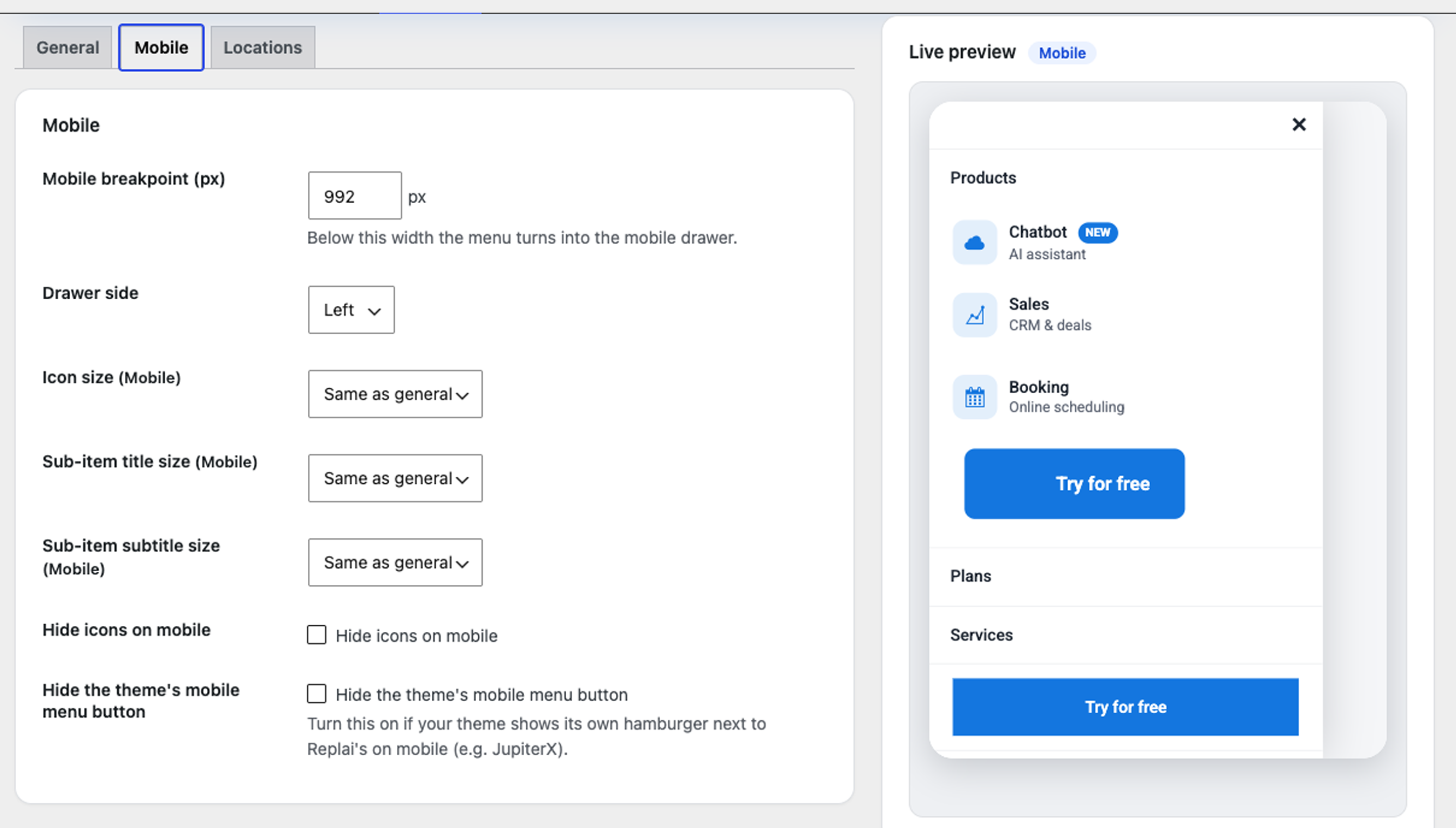
The Mobile settings with the live mobile preview: off-canvas drawer, expandable sections and a sticky call-to-action.