Responsive Grid Shortcode Wordpress Plugin - Rating, Reviews, Demo & Download
Plugin Description
The plugin utilizes the 12 column responsive grid CSS from http://www.responsivegridsystem.com/ with the default 1.6% margin and 480PX media query.
Major features in Responsive Grid Shortcode include:
- Responsive grids up to 12 columns
- Add classes to each column or section for precise control over styles.
- Simple to use shortcode. All you have to know is how to count to 12!
The shortcode are extremely simply to follow as they follow as you can see below.
[grid_section]

[grid_col size=4]
    First Col Content
[/grid_col]

[grid_col size=4]
    Second Col Content
[/grid_col]

[grid_col size=4]
    Third Col Content
[/grid_col]

[/grid_section]
NOTE: The one thing to keep in mind is that all the column sizes inside a section MUST equal 12.
Some things that you should note. Responsive Grid Shortcode default to size 6 if no size attribute is provided.
An example of this is below:
[grid_section]

[grid_col]
    Left Side
[/grid_col]

[grid_col]
    Right Side
[/grid_col]

[/grid_section]
FYI: The column size can be any number. The each size value represents {size} of 12.
OPTIONS
We kept the options extremely simple to make sure the system is light weight.
[grid_section class=custom-class]
- class – You can provide a custom class to the section if you choose.
[grid_col size=4 class=custom-class]
- class (optional) – You can provide a custom class to the column if you choose.
- size (optional) – number out of 12. (2 = 2 out 12 | 3 = 3 out of 12)
Screenshots
-

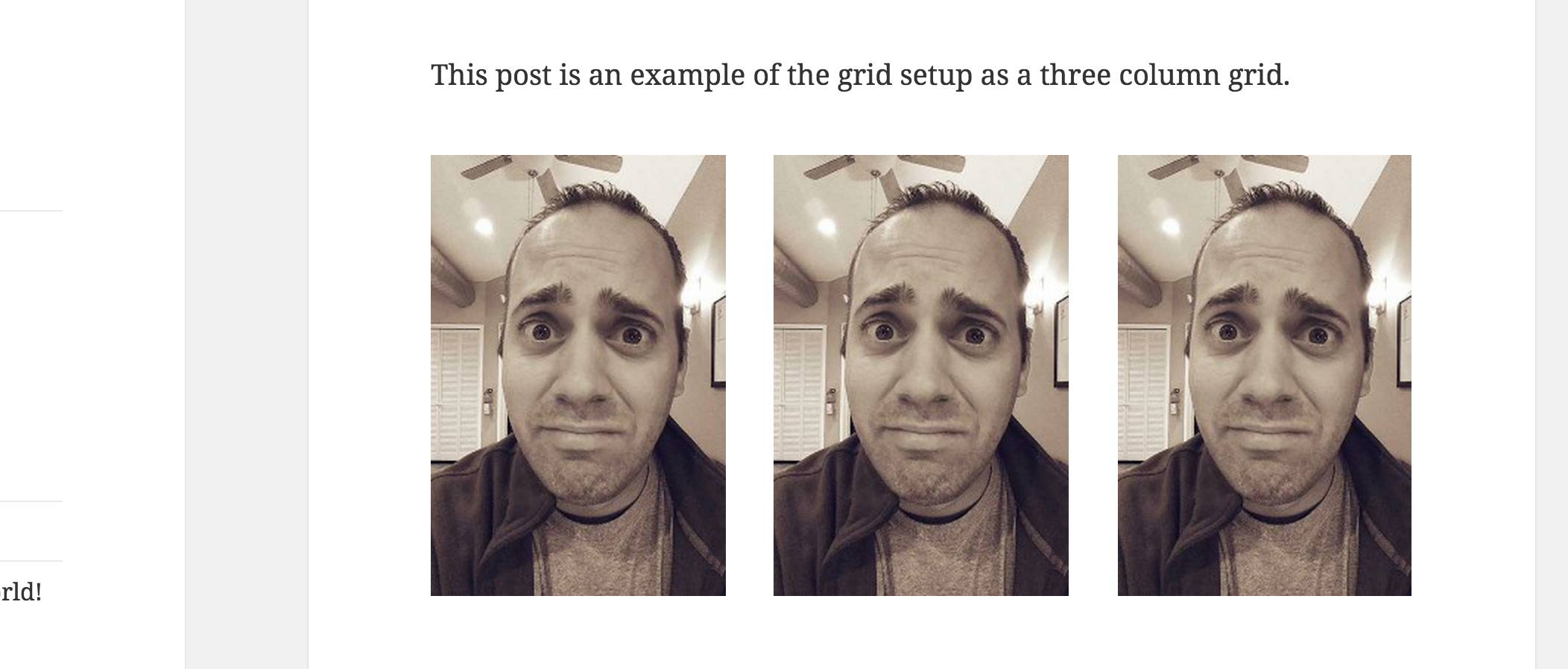
Easy and simple responsive 3 column layout