Swell Smart Responsive Block Suite Wordpress Plugin - Rating, Reviews, Demo & Download
Plugin Description
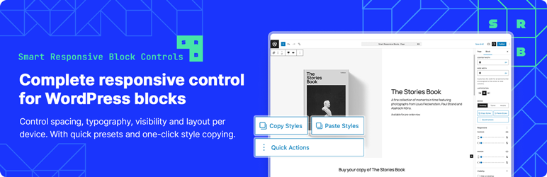
Make your WordPress blocks look great on every device without writing CSS.
Swell Smart Responsive Block Suite adds responsive controls right in the block editor. Adjust padding, margins, font sizes, and visibility for desktop, tablet, and mobile — and see changes live as you work.
What Makes This Different
Copy/Paste Styles – Styled one block perfectly? Copy those responsive settings and paste them to other blocks instantly.
Quick Actions – Common tasks like “Hide on Mobile” or “Responsive Heading” are one click away.
Inheritance Indicators – See which values are inherited from larger screens. Override them when you need to.
Core Features
Adjust spacing, font sizes, and visibility for three breakpoints: Desktop (1025px+), Tablet (768-1024px), and Mobile (767px-).
The responsive panel syncs with WordPress’s viewport switcher, so what you see is what you get.
Supported Blocks
Works with Group, Columns, Column, Cover, Heading, Paragraph, Button, List, Quote, and Pull Quote blocks.
Simple to Use
- Select a block
- Open the “Responsive” panel in the sidebar
- Switch between devices and adjust settings
- Changes appear live in the editor
That’s it. No setup, no config files, no learning curve.
Privacy
This plugin doesn’t track users, phone home, or collect data. Everything stays in your WordPress database.
Credits
Developed by Swell Apps
Screenshots
No screenshots provided