Webyx Wordpress Plugin - Rating, Reviews, Demo & Download

Plugin Description
This idea was born with the aim of creating amazing fullscreen websites in WordPress with Gutenberg editor’s modular approach.
We wanted to simplify and speed up the creating process, enabling customizations on the fly and making it as user friendly as possible.
We are already designing and developing new features and possibilities that will allow us to expand and improve the project more and more, and to be able to give users an increasingly easy and powerful tool.
Be amazed by your imagination!
the Webineer team
WHAT YOU CAN DO
Webyx for Gutenberg is a plugin for WordPress that allows you to create amazing fullscreen scrollable websites quickly and easily.
The Free version allows you to fully create your website and add effects to customize it according to your needs without writing a line of code.
The Premium version further enhances Webyx for Gutenberg’s power giving most demanding users more tools to help them improve their work and accomplish their ideas.
The Premium version is in testing phase and will be soon available. If you are interested get in touch with us using the form on Webyx website.
To see what is in the Free and Premium version visit our website at Webyx.
QUICK USER’S GUIDE
For a more complete documentation visit our website at Webyx.
How to add the block in Gutenberg
- Create a new post/page or go to the post/page you would like to add the block.
- Find Webyx for Gutenberg block on the Gutenberg blocks and add it to the page. IMPORTANT: you can add only one Webyx for Gutenberg block. You should not add any other blocks to the page.
Enable Webyx
- Click on the Page tab in the right side of Gutenberg editor.
- In pages attributes find the Template select and choose webyx.
Important note: Webyx for Gutenberg template provides a responsive custom menu.
Webyx navbar block utilities
You can change the Webyx for Gutenberg block size in the editor via preset options in its navbar.
- Small alignment: default block width (max-width 610px).
- Wide alignment: wider than default (max-width 1240px).
- Full alignment: full width (max-width removed).
Sections
Sections are containers that can have Slides only.
General actions on Sections:
- Add Section: click on Add Section button inside the Webyx for Gutenberg block.
- Remove Section: click on the More Options menu dots in the top navbar and click Remove Block.
- Add Slide: click on Add Slide button inside the Section block.
Section options
- Title: insert here a title for the current Section. IMPORTANT: you should give different titles for each Section otherwise some features may have problems (e.g. menu, bullets, etc.).
Slide navbar utility
- Hide background: hides Slide background (image or colour you have eventually chosen from the Slide background options group) only in the editor.
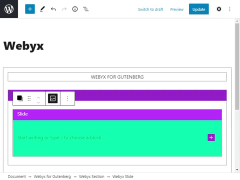
Slides
Slides are elements inside Sections that can have any type of content.
General actions on Slides:
- Add Slide: click on Add Slide button inside the Section block.
- Remove Slide: click on the More Options menu dots in the top navbar and click Remove Block.
- Add Slide content: click inside the Slide block and add Gutenberg blocks inside it. You can add anything inside here.
Slide general options:
- Title: insert here a title for the current Slide. IMPORTANT: you should give different titles for each Slide. (Please note that Slides within the same Section should be named differently, while between different Sections they could also have the same title.)
- Slide content position: select general content position in the current Slide (top, middle, bottom).
- Scrolling content: viewport exceeding Slide content will be displayed through scrolling.
Slide background options
- Background colour: choose the background colour to be applied from the colour box.
- Background image: to choose the background image to be applied, click on the Upload Image button and select the image from media library.
- Background image size: choose from a pre-estabilished set of sizes.
- auto: background image is displayed in its original size.
- cover: background image is resized to cover the entire container, even if it has to stretch the image or cut a little bit off one of the edges.
- contain: background image is resized to make sure the image is fully visible.
- Background image position: choose from a pre-estabilished set of positions. The first value is the horizontal position and the second value is the vertical.
- left top
- left center
- left bottom
- right top
- right center
- right bottom
- center top
- center center
- center bottom
- Background image repeat: choose if the background image should be repeated or not.
- repeat: background image is repeated both vertically and horizontally and the last image will be clipped if it does not fit.
- no-repeat: background image is not repeated and will only be shown once.
- Background image attachment: choose if the image scrolls with the rest of the Slide or is fixed.
- scroll: background image will scroll with the Slide.
- fixed: background image will not scroll with the Slide.
Slide Easings
In this group you can set the motion animation behavior for Slides, such as:
- Vertical speed: set the vertical animation speed from a pre-estabilished set of values (range from 300 to 1200 milliseconds with a step of 50).
- Vertical easing: set the vertical animation easing from a pre-estabilished set of curve types (31 types available).
- Horizontal speed: set the horizontal animation speed from a pre-estabilished set of values (range from 300 to 1200 milliseconds with a step of 50).
- Horizontal easing: set the horizontal animation easing from a pre-estabilished set of curve types (31 types available).
- Speed for IE9: set the general animation speed for Internet Explorer 9 browser from a pre-estabilished set of values (range from 300 to 1200 milliseconds with a step of 50).
- Easing for IE9: set the general animation easing for Internet Explorer 9 browser from a pre-estabilished set of curve types (5 types available: linear, easeout, arc, quadratic, cubic).
Navigation Arrows
In this group you can customize the look and behaviour of navigation arrows.
- Arrows size: available set of arrows sizes (small, medium, large).
- Arrows thickness: available set of arrows thicknesses (thin, standard, thick).
- Arrows curvature: enables a slight curvature to the arrows aesthetics.
- Arrows colour: choose the colour to be applied to arrows from the colour box.
- Mouse wheel: enables navigation between Slides via mouse wheel.
- Mouse wheel icon: if mouse wheel is enabled, with this option vertical navigation arrows will be replaced by a mouse wheel icon that will remain visible until the first movement between Slides.
- Mouse wheel icon colour: choose the colour to be applied to mouse wheel icon from the colour box.
Full Screen Button
In this group you can customize the look and behaviour of the full screen button.
- Full screen button: enables a button to switch to full screen display.
- Full screen button position: if full screen button is enabled it allows you to choose its position (left, right).
- Full screen button colour: choose the colour to be applied to full screen button from the colour box.
Mobile Devices
In this group you can set the motion animation behavior for Slides on mobile devices, such as:
- Vertical speed: set the vertical animation speed from a pre-estabilished set of values (range from 300 to 1200 milliseconds with a step of 50).
- Vertical easing: set the vertical animation easing from a pre-estabilished set of curve types (31 types available).
- Horizontal speed: set the horizontal animation speed from a pre-estabilished set of values (range from 300 to 1200 milliseconds with a step of 50).
- Horizontal easing: set the horizontal animation easing from a pre-estabilished set of curve types (31 types available).
Loading Splash Screen
In this group you can customize the look of the loading splash screen.
- Background colour: choose the colour to be applied to splash screen background from the colour box.
- Spinner colour: choose the colour to be applied to the spinner from the colour box.
Custom CSS
In this group you can add your custom CSS.
- Custom CSS: enables the Custom CSS button to open a pop-up window where you can enter your CSS code for the page.
Languages
- English
Documentation and Support
- For documentation visit our website at Webyx.
Screenshots
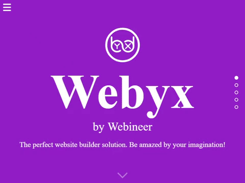
Webyx creating amazing fullscreen websites in WordPress with Gutenberg editor’s modular approach
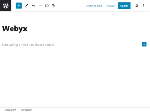
Add Webyx starting block
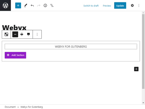
Add Webyx Section block
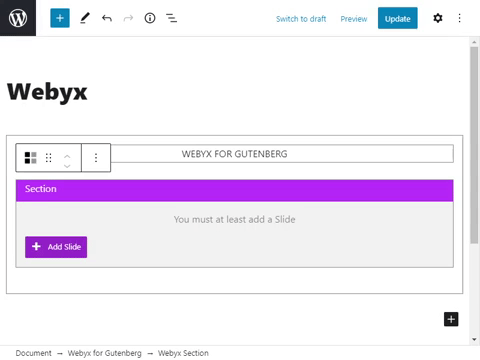
Add Webyx Slide block
Hide/show background colour/image