Webyx FE Wordpress Plugin - Rating, Reviews, Demo & Download
Plugin Description
This idea was born with the aim of creating amazing fullpage fullscreen websites in WordPress with Elementor’s visual editor and drag-and-drop builder.
We wanted to simplify and speed up the creating process, enabling customizations on the fly and making it as user friendly as possible.
We are already designing and developing new features and possibilities that will allow us to expand and improve the project more and more, and to be able to give users an increasingly easy and powerful tool.
Be amazed by your imagination!
the Webineer team
WHAT YOU CAN DO
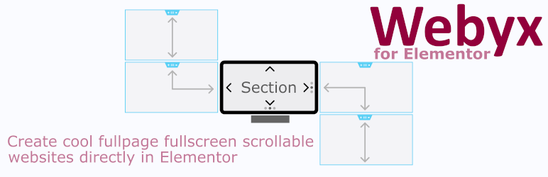
Webyx for Elementor is a plugin for WordPress that allows you to create amazing fullpage fullscreen scrollable websites quickly and easily.
This version allows you to fully create your fullpage fullscreen website and add effects to customize it according to your needs without writing a line of code.
If you are interested get in touch with us using the form on Webyx website.
FEATURES OF THE FREE VERSION
- Sections
- Scrolling content
- Continuous horizontal
- Section content position
- Panel style
- Template design
- Animation easings and speeds
- Navigation arrows
- Navigation bullets
- Navigation mouse wheel
- Navigation keyboard
- Fullscreen button
- Hide scrollbar
- Loading splash screen
- Mobile settings
- Custom CSS
- Built-in responsive menu
- Responsive
- Touch support
- Clean and minimized code
- Compatible with all modern browsers
- No jQuery
- Easy to use with hundreds of configurable options
- …and much more
FEATURES OF THE PRO VERSION ONLY
- View design
- Customizable header with menu
- Continuous vertical
- Horizontal scrolling
- Card style
- Parallax effect
- Indipendent animation types on X and Y axes
- Fade and toggle animations
- Normal scrolling website
- Section height autofill
- Lockable vertical movement
- Lockable horizontal swipe
- Mobile movement threshold
- Switchable foregrounds for each Section background
- Different backgrounds for each device type
- Background audio
- Background video
- Event hooks
- Visible or hidden Sections on the fly
- Automatic updates management
- Rollback to previous versions
- …and much more
TRY WEBYX FOR GUTENBERG
Are you also Gutenberg users and enthusiasts?
We have the version of Webyx explicitly built for Gutenberg.
Download and try the Webyx for Gutenberg Free version of our dedicated plugin!
QUICK USER’S GUIDE
For a more complete documentation visit our website at Webyx.
Webyx FE Settings
To customize general plugin settings just go to Settings > Webyx FE Settings.
- Hide WP admin top bar: hide WP admin top bar in Webyx pages preview.
- Enable Webyx menu: enable Webyx menu “Display location” in Appearance/Menus/Menu structure/Menu settings.
How to enable Webyx FE in Elementor
- Create a new page in WordPress.
- In pages attributes find the Template select and choose Webyx FE.
NOTE: if you select the webyx template through the Elementor general settings page, you will need to refresh the editor page to display webyx template correctly. - Edit the page with Elementor.
- Click on Settings button. You will see Webyx tab.
- Go to WEBYX FE tab.
- Toggle Enable Webyx option.
- Click on Apply Changes.
- Wait for the page preview to refresh.
NOTE: toggling the “Enable Webyx” option in SECTION GENERAL OPTIONS you can disable the work done with Webyx and go back to the classic mode of Elementor sections on the fly, without losing what has been previously done.
WEBYX FE SECTIONS
Webyx for Elementor allows you to wrap Elementor sections into Webyx sections.
Webyx sections are wrappers that incorporate the original Elementor sections and contain specific attributes and/or webyx settings.
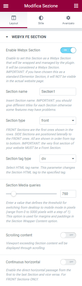
To be able to carry out this transformation, enable the “Enable Webyx Section” toggle: in this way the Elementor source section will be displayed in the editor in full screen mode
and the original light blue Elementor overlay border will be shown in purple colour.
It is important to remember that a non-enabled Webyx section will not be shown on the actual website: this is also useful for being able to turn on/off parts of the website (however, it will remain an
editable element in all its parts).
NOTE: Webyx FE sections are containers that can have any type of content.
To create the full screen flow of contents you can use the 2 types of sections provided by Webyx:
1. Front Sections
2. Side Sections
Front Sections
A Front Section appears as the leader of a strip of sections.
Remember that the height of the section will automatically extended to the height of the inserted content inside the Elementor’s visual editor preview.
While in the actual website if the content exceeds the viewport you can view it by enabling the “scrollable content” option.
IMPORTANT: the very first section of your website MUST be a Front Section.
Side Sections
Side Sections will be placed laterally and immediately following their respective leaders on the website, while inside the visual editor they will be presented one below the other vertically following their order.
Section general options
- Enable Webyx Section: enable to set this Section as a Webyx Section that will be wrapped and managed by the plugin. It will be considered a Webyx Section.
IMPORTANT: if you have chosen this as a standard Elementor Section, it will NOT be visible in the actual website page. - Section name: insert Section name. IMPORTANT: you should give different titles for each Section otherwise some features may have problems.
- Section type: FRONT Sections are the first ones shown in the rows. SIDE Sections are positioned laterally to the FRONT ones. All are shown in order from top to bottom. IMPORTANT: the very first section of your website MUST be a Front Section.
- Section Tag type: select HTML tag type. This parameter changes the Section HTML tag to the specified tag.
- Section Media queries: enter a value that defines the threshold for switching from desktop to mobile mode in pixels (range from 0 to 5000 pixels with a step of 1).
This option is used for margins and paddings in the Section Wrapper Content option. In the Pro version is also used to shape backgrounds of the Sections (i.e. you can have a background colour in Desktop mode and an image in Mobile mode). - Scrolling content: viewport exceeding Section content will be displayed through scrolling.
- Continuous horizontal: enables direct horizontal passage from first to last Section of the same section strip and vice versa.
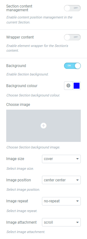
- Section content management: enable content position management in the current Section.
- Section content position: select general content position in the current Section (top, middle, bottom).
- Wrapper content: enable element wrapper for the Section’s content.
- Wrapper CSS class(es): you can add your own CSS class(es). Separate multiple classes with spaces.
- Wrapper margin: enable wrapper margin for the Section’s content for desktop and mobile devices, you can insert values to apply a margin (top, right, bottom, left).
- Wrapper padding: enable wrapper padding for the Section’s content for desktop and mobile devices, you can insert values to apply a padding (top, right, bottom, left).
Section background options
- Background: enable background management.
- Background colour: choose the background colour to be applied from the colour box.
- Background image: to choose the background image to be applied, click on the Upload Image button and select the image from media library.
- Background image size: choose from a pre-estabilished set of sizes.
- auto: background image is displayed in its original size.
- cover: background image is resized to cover the entire container, even if it has to stretch the image or cut a little bit off one of the edges.
- contain: background image is resized to make sure the image is fully visible.
- Background image position: choose from a pre-estabilished set of positions. The first value is the horizontal position and the second value is the vertical (left top, left center, left bottom, right top, right center, right bottom, center top, center center, center bottom).
- Background image repeat: choose if the background image should be repeated or not.
- repeat: background image is repeated both vertically and horizontally and the last image will be clipped if it does not fit.
- no-repeat: background image is not repeated and will only be shown once.
- Background image attachment: choose if the image scrolls with the rest of the Section or is fixed.
- scroll: background image will scroll with the Section.
- fixed: background image will not scroll with the Section.
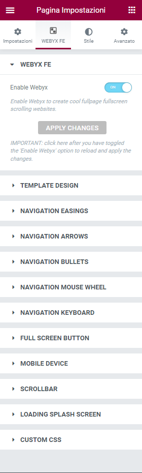
WEBYX FE SETTINGS
Click on the gear icon located at the bottom left of the Elementor panel and selected WEBYX FE tab.
Webyx FE settings allows you to control and edit basic information about webyx page configuration. Here you can give your template, navigation, easings and other settings.
WEBYX FE
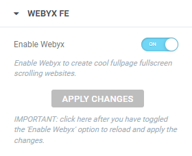
- Enable Webyx: enable Webyx to create cool fullpage fullscreen scrolling websites.
APPLY CHANGES: click here after you have toggled the “Enable Webyx” option to reload and apply the changes.
NOTE: with this function you can disable the view and the work done with Webyx and go back to the classic mode of Elementor sections on the fly, without losing what has been previously done.
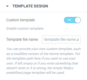
TEMPLATE DESIGN
In this group you can set the custom template page, such as:
- Custom Template: enabled custom template page.
- Template file name: path to the custom template page file (example: page-custom.php or path-topage-custom.php).
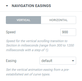
NAVIGATION EASINGS
In this group you can set the motion animation behavior for Sections, such as:
- Vertical speed: set the vertical animation speed from a pre-estabilished set of values (range from 300 to 1200 milliseconds with a step of 1).
- Vertical easing: set the vertical animation easing from a pre-estabilished set of curve types (31 types available).
- Horizontal speed: set the horizontal animation speed from a pre-estabilished set of values (range from 300 to 1200 milliseconds with a step of 1).
- Horizontal easing: set the horizontal animation easing from a pre-estabilished set of curve types (31 types available).
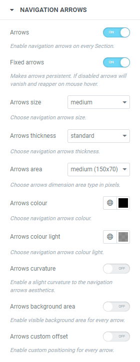
NAVIGATION ARROWS
In this group you can customize the look and behaviour of navigation arrows.
NOTE: Webyx has two navigation modes: Desktop and Mobile (touch events). In Desktop mode every navigation clickable type is visible (arrows, bullets, etc) while in Mobile (touch events) arrows and mouse wheel will not be present and only bullets will be shown.
- Navigation arrows: enables clickable navigation arrows on every Section to move from one Section to the next.
- Fixed arrows: if navigation arrows are enabled it makes them persistent, otherwise arrows will fade and reappear only on mouse hover their original position.
- Arrows size: available set of arrows sizes (small, medium, large).
- Arrows thickness: available set of arrows thicknesses (thin, standard, thick).
- Arrows dimension area: available set of arrows dimension areas in pixels (small (80×50), medium (150×70), large (300×90)).
- Arrows colour: choose the colour to be applied to arrows from the colour box.
- Arrows colour light: choose the colour to be applied to arrows when not mouse hovered from the colour box.
- Arrows curvature: enables a slight curvature to the arrows aesthetics.
- Arrows background area: enables visible background area for every arrow.
- Arrows background area colour: choose the colour to be applied to every arrow background area from the colour box.
- Arrows custom offset: enables custom positioning for every arrow (range from 0 to 100 pixels with a step of 1).
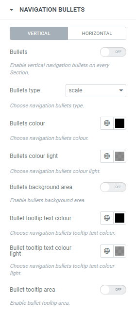
NAVIGATION BULLETS
In this group you can customize the look and behaviour of navigation bullets.
- Vertical bullets: enables vertical clickable navigation bullets on every Section to move from current Section to the target one.
- Vertical bullets position: if vertical navigation bullets are enabled it allows you to choose their position (right, left).
- Vertical bullets offset: enables custom positioning for every vertical bullet (range from 0 to 100 pixels with a step of 1).
- Vertical bullet offset left
- Vertical bullet offset right
- Vertical bullets tooltips: if vertical navigation bullets are enabled shows the name on each vertical bullet of the corresponding Section on mouse hover.
- Vertical bullets fixed tooltips: if vertical navigation bullets tooltips are enabled they become persistent.
- Horizontal bullets: enables horizontal clickable navigation bullets on every Section to move from current Section to the target one.
- Horizontal bullets position: if horizontal navigation bullets are enabled it allows you to choose their position (top, bottom).
- Horizontal solo bullet: if horizontal navigation bullets are enabled makes a bullet present even in the case of a single horizontal Section.
- Horizontal bullets offset: enables custom positioning for every horizontal bullet (range from 0 to 100 pixels with a step of 1).
- Vertical bullet offset top
- Vertical bullet offset bottom
- Horizontal bullets tooltips: if horizontal navigation bullets are enabled shows the name on each horizontal bullet of the corresponding Section on mouse hover.
- Horizontal bullets fixed tooltips: if horizontal navigation bullets tooltips are enabled they become persistent.
- Bullets type: available set of bullets types (7 types available: scale, stroke, small stroke, fill-in, fill-up, fall, puff).
- Bullets colour: choose the colour to be applied to bullets from the colour box.
- Bullets colour light: choose the colour to be applied to bullets when not mouse hovered from the colour box.
- Bullets background area: enables bullets background area colour.
- Bullets background area colour: choose the colour to be applied to every bullet background area from the colour box.
- Bullets tooltips colour: choose the colour to be applied to bullets tooltips texts from the colour box.
- Bullets tooltips colour light: choose the colour to be applied to bullets tooltips texts when not mouse hovered from the colour box.
- Bullet tooltip background area: enables bullets tooltip background area.
- Bullet tooltip background area colour: choose the colour to be applied to bullets tooltips texts when not mouse hovered from the colour box.
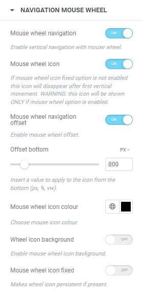
NAVIGATION MOUSE WHEEL
In this group you can customize the look and behaviour of navigation mouse wheel.
- Mouse wheel: enables navigation between Sections via mouse wheel.
- Mouse wheel icon: if mouse wheel is enabled, with this option vertical navigation arrows will be replaced by a mouse wheel icon that will remain visible until the first movement between Sections.
- Mouse wheel icon colour: choose the colour to be applied to mouse wheel icon from the colour box.
- Mouse wheel icon background: enables mouse wheel icon background.
- Mouse wheel icon background colour: choose the colour to be applied to mouse wheel icon background area from the colour box.
- Mouse wheel icon fixed: if mouse wheel icon is enabled it makes it persistent.
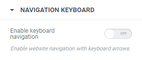
NAVIGATION KEYBOARD
In this group you can activate website navigation via keyboard.
- Navigation keyboard: enables navigation between adjacent Sections via keyboard arrows.
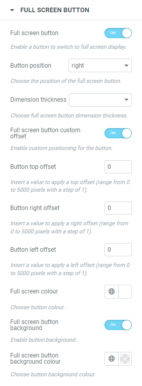
FULL SCREEN BUTTON
In this group you can customize the look and behaviour of the full screen button.
- Full screen button: enables a button to switch to full screen display.
- Full screen button position: if full screen button is enabled it allows you to choose its position (left, right).
- Full screen button dimension thickness: available set of thicknesses (thin, standard, thick).
- Full screen button custom offset: enables custom positioning for the button (range from 0 to 100 pixels with a step of 1).
- Full screen button offset top
- Full screen button offset left
- Full screen button offset right
- Full screen button colour: choose the colour to be applied to full screen button from the colour box.
- Full screen button background: enables button background.
- Full screen button background colour: choose the colour to be applied to full screen button background area from the colour box.
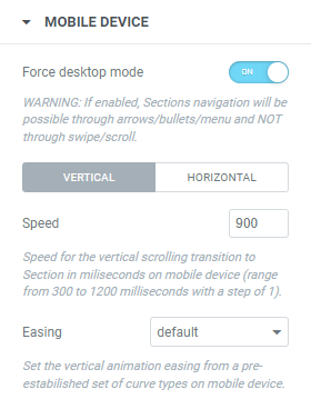
MOBILE DEVICES
In this group you can set the motion animation behavior for Sections on mobile devices, such as:
- Force desktop mode: enables Sections navigation through arrows/bullets/menu and NOT through swipe/scroll.
- Vertical speed: set the vertical animation speed from a pre-estabilished set of values (range from 300 to 1200 milliseconds with a step of 1).
- Vertical easing: set the vertical animation easing from a pre-estabilished set of curve types (31 types available).
- Horizontal speed: set the horizontal animation speed from a pre-estabilished set of values (range from 300 to 1200 milliseconds with a step of 1).
- Horizontal easing: set the horizontal animation easing from a pre-estabilished set of curve types (31 types available).
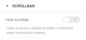
SCROLLBAR
In this group you can customize the behaviour of the browser’s default scrollbar.
- Hide scrollbar: hides browser’s default scrollbar in the Sections when it should be present.
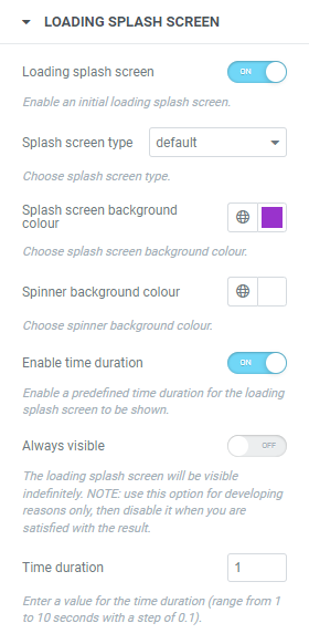
Loading Splash Screen
In this group you can customize the look of the loading splash screen.
- Loading Splash Screen: enables loading splash screen.
- Splash screen type: choose the splash screen type:
- default
- custom
- Background colour: choose the colour to be applied to splash screen background from the colour box.
- Spinner colour: choose the colour to be applied to the spinner from the colour box.
- Initial loading message: message to be displayed during the website loading.
- Message colour: choose the colour to be applied to initial message from the colour box.
- Background image: to choose the background image to be applied, click on the Upload Image button and select the image from media library.
- Enable time duration: enables a predefined time duration for the loading splash screen to be shown.
- Always visible: the loading splash screen will be visible indefinitely.
- Time duration: set the value for the time duration (range from 1 to 10 seconds with a step of 0.1).
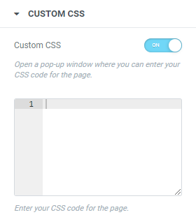
CUSTOM CSS
In this group you can add your custom CSS.
- Custom CSS: enables the Custom CSS button to open a pop-up window where you can enter your CSS code for the page.
Languages
- English
Documentation and Support
- For documentation visit our website at Webyx.
Screenshots
WEBYX FE SETTINGS
WEBYX FE
TEMPLATE DESIGN
NAVIGATION EASINGS
NAVIGATION ARROWS
NAVIGATION BULLETS
NAVIGATION MOUSE WHEEL
NAVIGATION KEYBOARD
FULL SCREEN BUTTON
MOBILE DEVICE
SCROLLBAR
LOADING SPLASH SCREEN
CUSTOM CSS
WEBYX FE SECTION 1
WEBYX FE SECTION 2