WIMPLE Contact Form Wordpress Plugin - Rating, Reviews, Demo & Download
Plugin Description
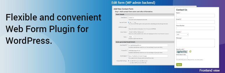
A flexible and super-easy Web Form plug-in for WordPress to create Contact or any kind of forms for web sites and apps.
Create web forms for –
1. Contact Us
2. Feedback
3. Technical / Product Support Query
4. Customer Complaint
5. General Inquiry
or whatever form you can think of.
-
Simple UI to interactively design forms — no code to define any field or its behavior.
-
Select data types for fields from the most commonly used pre-defined set.
-
Supported data types: Single-line Text, Multi-line Text, Dropdown List, Radio Buttons, Checkbox, Date, Note, CAPTCHA.
-
Set custom help/hint and validation error messages to show for each field.
-
Specify prompt for each single-line and multi-line text field.
-
Place fields anywhere within the form as needed.
-
Set or edit the size (width) and position of fields within a row or across rows.
-
Add one or more field(s) in one row.
-
Edit all the details — type, messages, size, location — for any field at any time.
-
Delete a field or an entire row of field(s), and create a new one, if needed.
-
Customize the auto-generated default HTML and CSS as per your choice (e.g., to match the web site / page).
-
Receive auto-generated email with form data via your own SMTP server or AWS-SES — set up step-by-step using interactive UI, no coding needed.
-
Completely clean code, with no script embedded.
FEATURES
-
Create and manage any number of forms using the plug-in.
-
Use the same form or different forms for different web pages.
-
Use custom email id[s] (not necessarily admin email only) as From (sender) and To (recipient) address for the form.
-
Interactively create form from WP administrator backend — add, remove, edit field values / options, place anywhere within form.
-
View the form in the right pane when it is being created; modify as needed and see that too.
-
Use any one of five ready-made themes to display form in the frontend, or customize the selected theme as needed.
-
Use default theme, so that the form uses site’s theme for which it has been created.
-
Send form data via auto-generated email using your SMTP server (easy) or AWS SES – API Signature version 4 (better deliverability).
HOW TO DISPLAY THE FORM TO THE USER (frontend)
-
Copy the ‘Shortcode’ for the form from plug-in’s admin backend.
-
Use WordPress function ‘do_shortcode()’ with the above Shortcode in the PHP file for the required web page.
NOTE: You can use the same ‘Shortcode’ in multiple web pages.
PRIVACY POLICY
As per the arrangement of the WIMPLE Web Form Plug-in, admin needs to specify the email settings for sending the auto-generated email with the form data from specified sender email id to recipient email id. There are two supported options, for each of which the admin needs to provide the following information.
-
AWS-SES: Admin needs to provide —
a) AWS Endpoint
b) AWS account ‘Access Key’
c) AWS account ‘Secret Access Key’ -
SMTP server other than AWS-SES: Admin needs to provide —
a) SMTP Server Address
b) SMTP Server Port
c) Username
d) Password
NOTE: These data are put in the code (wp-config.php) and stored on the server where the plug-in is installed. These are used only to send the emails generated based on the form. SARANGSoft does NOT get / have any access to these information.
The auto-generated emails with the form data from WIMPLE Web Form Plug-in via AWS SES (Simple Email Service) are sent using Signature version 4 for better security.
FREQUENTLY ASKED QUESTIONS (FAQ)
-
How to Display the form to the user (in frontend)?
a) Copy the ‘Shortcode’ for the form from plug-in’s admin backend.
b) Use WordPress function ‘do_shortcode()’ with the above Shortcode in the PHP file for the required web page. -
Can we use the same form in more than one page in user end (frontend)?
Yes, you can use the same form (‘Shortcode’) in multiple web pages. -
What theme is used by the plug-in?
There are five (5) built-in themes (color-oriented) with this plug-in. Select any one of those as per your needs, and then customize the CSS for selected theme as you see fit to suit your web site / page.
Screenshots

Site admin creates a form, sets basic properties, and chooses the preferred mail settings.

Blank form layout (in the right pane) before starting to define its field(s).

Add the first field (type ‘Radio Button’) and set its properties in the left pane.

Upon adding the field, see immediate update in form layout in the right pane.

Add the second field ‘Name’ (type ‘Single-line Text’) and set its properties.

‘Name’ field is made mandatory and placed on the second row.

Add the third field ‘Phone Number’ (type ‘Single-line Text’) with the ‘Numeric Only’ option.

‘Phone number’ is added on the third row with 33% width.

Add the field ‘Profession’ (type ‘Dropdown List’) with its properties, including the permitted options separated by ‘|’.

‘Profession’ with 33% width is placed to the right of ‘Phone Number’ on the third row.

Add ‘Email’ field (type ‘Single-line Text’) with its properties, including the ‘Email Validation’ option (will accept only valid email format input).

The ‘Email’ field is placed on the fourth row.

Add the ‘Question’ field (type ‘Multi-line Text’) with maximum 500 characters and place it on a new row.

After adding ‘Question’, the latest form layout is shown in the right pane.

Add a ‘Checkbox’ type field in a new (sixth) row.

In the right pane, the checkbox field appears at the bottom of the form.

Add ‘Date of birth'(type ‘Date’) field, placed in between ‘Phone number’ and ‘Profession’ on the third row.

‘Date of birth’ field is seen in between ‘Phone number’ and ‘Profession’ fields with a calendar date picker.

Adding ‘CAPTCHA’ type field on a new row.

The ‘CAPTCHA’ field appears below the ‘Checkbox’ type field.

Add a ‘Note’ type field (with rich text editor) to display any important information / notification.

A formatted text (read-only) is now placed on the last row of the form.

Use ‘Edit’ mode (hover mouse over field in right pane and click ‘Edit’ ) to change ‘Name’ field width from 100% to 50%.

The ‘Name’ field now takes half of its original width.

Edit the ‘Email’ field to put it to the right of ‘Name’ with 50% width.

The ‘Email’ field is now placed after ‘Name’ on the same (second) row.

In the right pane, hovering mouse over a row of field(s) shows ‘Edit’ and ‘Delete’ icons; an entire row can be deleted via the ‘Delete’ icon.

View the newly-created form (depending on existing page layout) as it will appear to the frontend user.