Image And Video Lightbox, Image PopUp Wordpress Plugin - Rating, Reviews, Demo & Download

Plugin Description
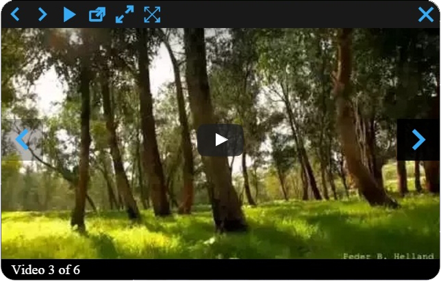
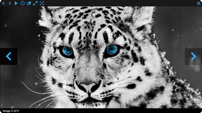
WordPress Image and Video Lightbox is an high customizable and responsive plugin for displaying images and videos in popup. You just need install our plugin and enable it.
There are a lot of settings that will help you to configure what you need.
Check our plugin demo page here
If are using a lot of images and videos on your website then this plugin is an necessary one for you.
Our plugin have a lot of free and Premium features, here are some of them.
Features of free version
- Fully Responsive
- Handy admin panel and easy use
- Tested on all modern browsers
- Works perfectly with all versions of WordPress
- Image and Video lightbox
- Ability to set Popup background color, Initial Width, Initial Height, Max Width and Height, Position, Fixed position, Border color, Border radius and width, Opening type
- Overlay transparency
- Ability to upload loading thumbnail
- Ability to show Show/Hide Control Buttons in content or outside content
- Ability to set Control Buttons Line Background Color and Height
- Ability to change/upload all control buttons
- Ability to Show/Hide information panel
- Ability to show information panel inside content or outside content
- Ability to set information line background color and height
- Ability to change count text
- Ability to set Count, Description and Title sections padding left and right parameter, text font size
- Ability to Show/Hide default description text if the photo doesn’t have caption or title
- Ability to set default description text if the photo doesn’t have caption
- Ability to set default Title text if the photo doesn’t have title attribute
- Ability to set information line elements ordering
- Ability to hide Count, Description and Title sections
- Ability to download images
- User friendly back-end
- Tested on popular WordPress themes
You can upgrade the free version to Pro Version to add some great features.
The features of Pro version
- Popup opening 12 animation effects(animation duration)
- Nice Slideshow
- Ability to set Slideshow Time
- Ability to select animation type and duration
- Ability to use fullscreen functionality
- Ability to set overlay top background color
- Overlay bottom background color
- Control buttons line transparency and hover background transparency
- Ability to Enable/Disable left and right navigation buttons mouseover functionality
- Ability to Show/Hide left and right navigation buttons inside popup
- Ability to set Background color and transparency of left and right navigation buttons inside popup(aslo, when hovering)
- Ability to Show/Hide left and right navigation buttons in overlay
- Ability to set Background color and transparency of left and right navigation buttons(alos, in overlay when hovering)
- Count, Description and Title sections text font family(31 fonts), font weight, font style, color
- Information line transparency and hover transparency
- Ability to enable overlay fade effect
- Ability to set overlay fade effect time and Navigation line ordering
- Ability to order elements
- Ability to hide any navigation button
- Premium support
If you found any bug or mistake in our plugin or have a question contact us at support@wpdevart.com, we will be happy to fix it.
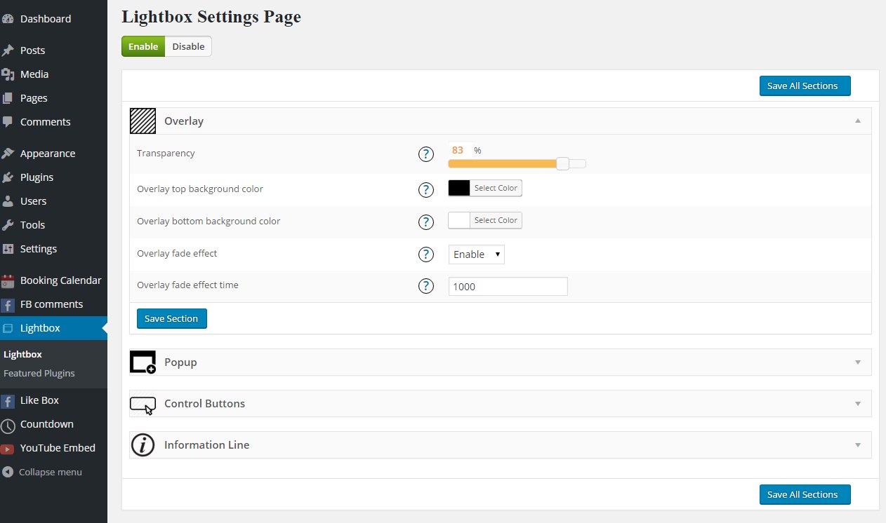
Overlay Settings
- Transparency – Set the transparency
- Top background color – Choose top background color
- Bottom background color – Choose bottom background color
- Fade effect – Enable/Disable fade effect
- Fade effect time – Set fade effect time
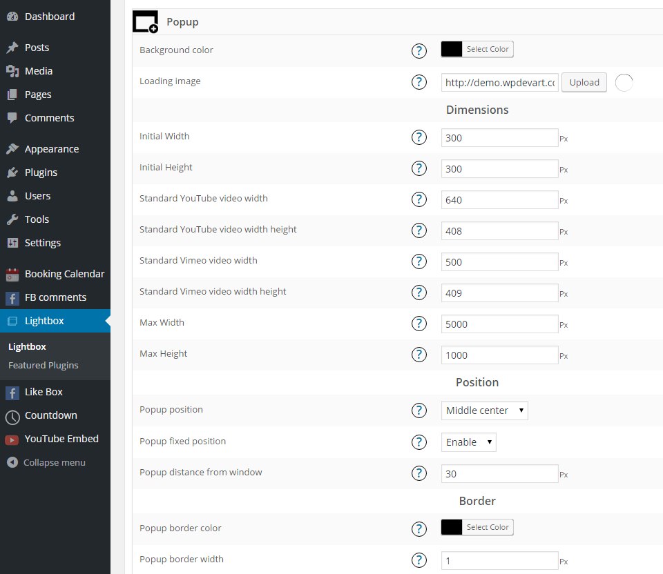
Popup Settings
- Background color – Set the background color
- Loading thumbnail(.gif) – Type the url or upload the .gif thumbnail
- Initial Width – Type initial width
- Initial Height – Type initial height
- Max Width – Type Max width for
- Max Height – Type Max height
Position
- Position – Select the position
- Fixed position – Enable/Disable fixed position
- Distance from window when position is 1,2,3,4,6,7,8,9 – Type distance from window when position is 1,2,3,4,6,7,8,9(except Middle center position)
Border
- Border color – Set the border color
- Border width – Type the border width
- Border radius – Set the border radius
Animation
- Opening type – Choose the opening type
- Opening animation type – Choose opening animation type
- Animation duration – Choose duration of animation
Elements ordering
- Elements ordering – Set the ordering of elements
Control Buttons Settings
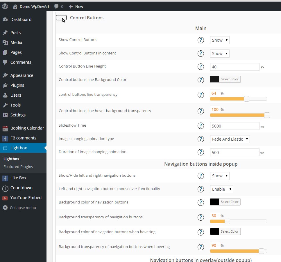
Main
- Show Control Buttons – Show/Hide control buttons
- Show Control Buttons in content – Show/Hide control buttons in content
- Control Button Line Height – Type Control Button Line Height
- Control buttons line Background Color – Choose control buttons line background color
- Control buttons line background transparency – Set control buttons line background transparency
- Control buttons line hover background transparency – Set control buttons line hover background transparency
- Show/Hide left and right navigation buttons inside popup – Choose to show or hide left and right navigation buttons
- Enable/Disable left and right navigation buttons mouseover functionality – This functionality will show left and right navigation buttons only when you navigate with your mouse on photo, if you disable it then your navigation buttons always will be active
- Show/Hide left and right navigation buttons in overlay – Choose to show or hide left and right navigation buttons in overlay
- Background color of left and right navigation buttons in overlay when hovering – Set the background color of left and right navigation buttons in overlay when hover
- Background transparency of left and right navigation buttons in overlay when hovering – Set the background transparency of left and right navigation buttons in overlay when hover
- Slideshow Time – Type the Slideshow Time
- Animation type – Select the animation type
- Duration of animation – Type duration of animation
Images
- Previous img(icon), Next img(icon) inside popup
- Previous img(icon), Next img(icon) in overlay
- Previous img(icon)
- Previous img(icon) when hovering(optional)
- Next img(icon)
- Next img(icon) when hovering(optional)
- Play img(icon)
- Play img(icon) when hovering(optional)
- Pause img(icon)
- Pause img(icon) when hovering(optional)
- Download img(icon)
- Download img(icon) when hovering(optional)
- Open in new window img(icon)
- Open in new window img(icon) when hovering(optional)
- Full width img(icon)
- Full width img(icon) when hovering(optional)
- Full width reset img(icon)
- Full width reset img(icon) when hovering(optional)
- Full screen img(icon)
- Full screen img(icon) when hovering(optional)
- Full screen reset img(icon)
- Full screen reset img(icon) when hovering(optional)
- Close img(icon)
- Close img(icon) when hovering
Ordering
- Navigation line ordering – Set the navigation line ordering
Information Line Settings
- Show information panel – Choose to show/hide information panel
- Show information panel in content – Show information panel inside or outside content
- Information line height – Type information line height
- Information line background color – Choose information line background color
- Information line transparency – Set the information line transparency
- Information line hover transparency – Set the information line hover transparency
- Count text – Type the count text
Count
- Count section padding left – Type the count section padding left
- Count section padding right – Type the count section padding right
- Count section text font size – Type the count section text font size
- Count section text font family – Select the count section text font family
- Count section text font weight – Select the count section text font weight
- Count section text font style – Select the count section text font style
- Count section text color – Set the count section text color
Description
- Description section padding left – Type the description section padding left
- Description section padding right – Type the description section padding right
- Description section text font size – Type the description section text font size
- Description section text font family – Select the description section text font family
- Description section text font weight – Select the description section text font weight
- Description section text font style – Select the description section text font style
- Description section text color – Set the description section text color
- Default description text if the photo doesn’t have caption – Type the default description text if the photo doesn’t have caption
Title
- Title padding left – Type the title padding left
- Title padding right – Type the title padding right
- Title font size – Type the title font size
- Title font family – Select the title font family
- Title font weight – Select the title font weight
- Title font style – Select the title font style
- Title color – Set the title color
- Default Title text if the photo doesn’t have title attribute – Type the default title text if the photo doesn’t have title attribute
Ordering
- Information line elements ordering – Set the information line elements ordering

