WP Tools Gravity Forms Divi Module Wordpress Plugin - Rating, Reviews, Demo & Download

Plugin Description
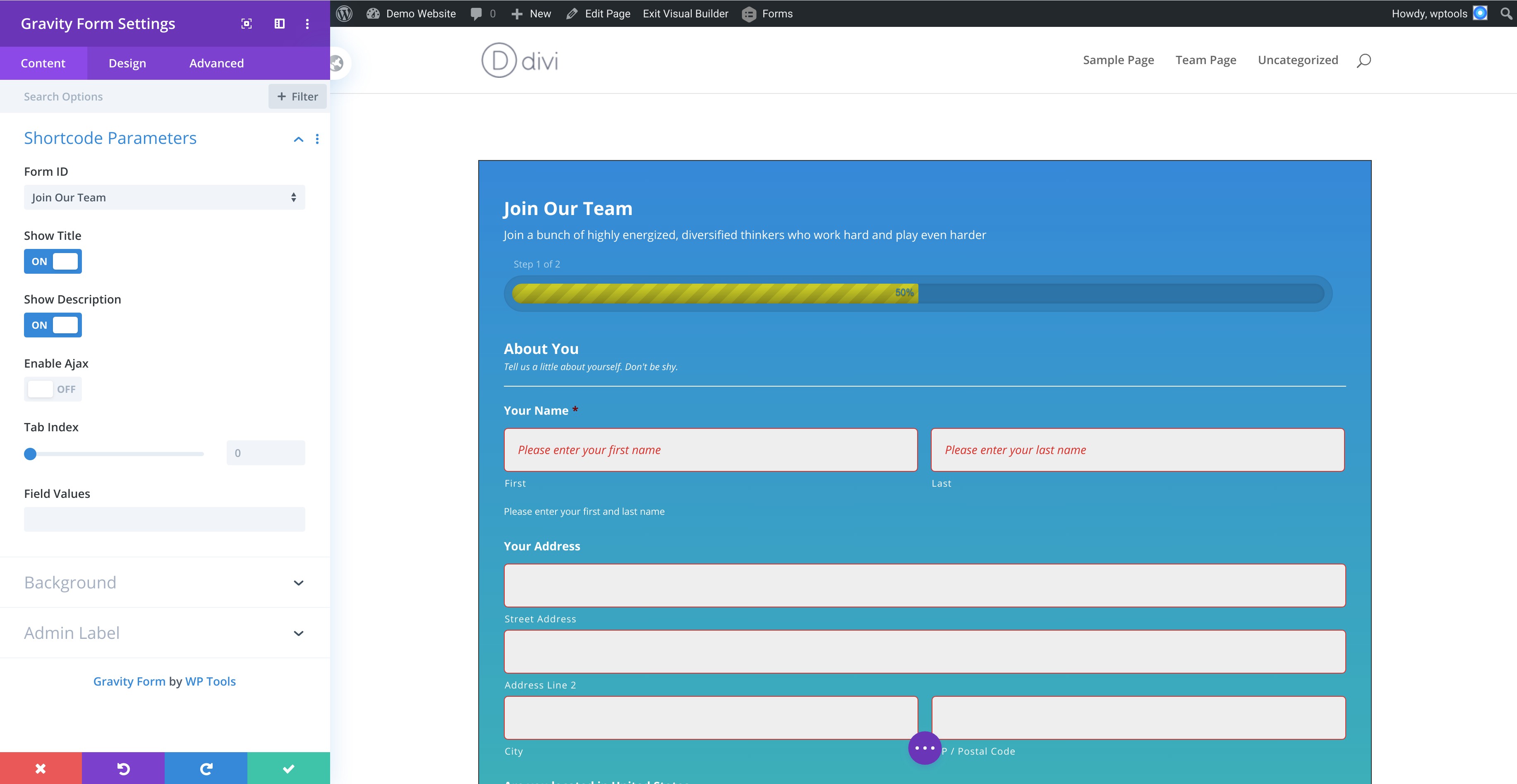
Embed gravity forms in Divi visual builder. Add styles for gravity forms border, background, title, description, inputs, labels, placeholder, errors, submit button & more. Premium version has 7-day FREE trial. No upfront payments needed.
It has dependencies on the following,
- Divi Theme – Affiliate link
- Gravity Form – Affiliate link
With the FREE plugin you can,
* Add a gravityform on a divi page using the visual builder.
* Configure the gravityform shortcode params
Gravityform Shortcode Parameters
- Show Title – Toggle to display the form title. Defaults is
on - Show Description – Toggle to display the form description. Defaults is
on - Ajax – Toggle to use AJAX to submit the form. Defaults is
off - Tab Index – Specify the starting tab index for the fields of this form
- Field Values – Specify the default field values.
- Example: field_values=’check=First Choice,Second Choice’. See also https://docs.gravityforms.com/using-dynamic-population/ for detailed information on dynamic population.
Premium Plugin
Premium plugin is available at https://wptools.app/wordpress-plugin/gravity-forms-divi-module/
We offer a 7-day FREE trial on the premium plugin.
Style Form Background, Spacing & Border
Set color, gradient, image or video backgrounds. Add border, margin & padding to form wrapper.
Style Gravity Form Title
Style the title typography and spacing using the divi module
Style Gravity Form Description
To render gravityform description, toggle the Show Description to on in Gravityform Shortcode Parameters.
Style the description typography and spacing using the divi module
Style Gravity Form Section Break Field
Section break field adds a content separator to your gravity form – https://docs.gravityforms.com/section-break/
Style the content’s title, description, spacing and border color using the divi module.
Style Input Fields, Input Wrapper & Input Placeholder
- Input fields are text, textarea, checkbox and radio fields.
Input Wrapperwraps an input field. Manage input wrappers margin and padding.- Add background, border and rounded corners for text, textarea and dropdown fields.
- Manage typography for input fields in the
Input Generalsection.- Manage checkbox and radio typography settings in
Checkbox/Radiosection.
- Manage checkbox and radio typography settings in
- Manage margin and padding for text fields.
- Manage typography for input placeholder text.
Style Label, Sub-Label & Input Field Description
Style gravityform’s label, sub-label and description for the inputs.
Set typography and spacing for them.
Style Field Wrapper
A field wrapper wraps the input field, label, sub-label and description.
Manage the field wrappers padding and margin in divi.
Style Form & Field Validation Errors
- Form Validation Error is a general validation error text for the whole form.
- Manage typography, border color, margin and padding.
- Field Validation Error shows the validation per field.
- Manage typography, border color, background color, margin & padding.
Style Forms Submission Confirmation Message
https://www.youtube.com/watch?v=Vk_uk
Form submission displays a message. Style typography & background of the confirmation message.
Style Gravityform Button
Set button alignment, typography, border, rounded corner and background color with hover styles.
Style Consent Field & Description
A gravityform consent field is a checkbox accompanied by description.
It’s a compulsory field.
Style the checkbox’s and description’s typography, margin & padding
Style Gravityform Footer
Footer wraps the form buttons. Manage margin and padding for this element.
Style Progress Bar
A multi-step gravityform has a progressbar at the top.
Style the progressbar title’s typography, progressbar’s background and font color.
Custom CSS Setting
A fine-grained control over writing custom css for large number of form elements


