Suffusion Collapse Menu Wordpress Plugin - Rating, Reviews, Demo & Download

Plugin Description
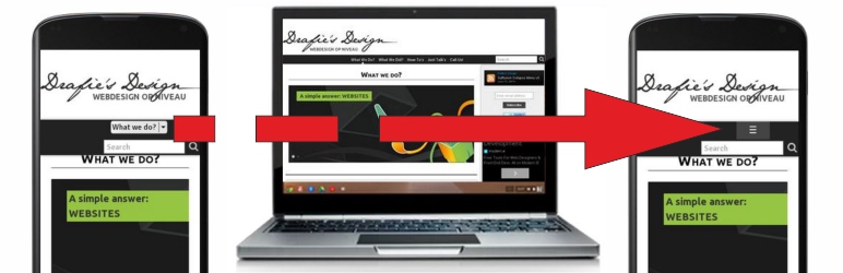
Stylize Suffusion Menu on mobiles
This Plugin improve the look of menu loaded by Suffusion on mobile devices. The Plugin just load Responsive Nav files, replacing the regular select lists used by Suffusion on mobile devices.
The menu is settled to follow the breakpoint settled at Suffusion Options -> Layouts -> Responsive Layouts -> Switches -> Navigation Menu. On higher resolutions are used the regular Suffusion Navigation Bars.
If you use both navigation bars (Above and Below Header), they are joined in only one collapse menu, that’s it – you cannot have multiple menus with this plugin.(on larger screens, both menus are restored).
I choosed this solution for solving also the problem of 2 select lists which are displayed on mobile devices in Navigation Bar Above Header if both navigation bars are used. Also the plugin restore the “home” image in menu on mobile devices (as of version 0.3).
However, if you have too much menu items, in complicated structures, with many levels of dropdowns, maybe better is to remain on select lists and style them with my other plugin: Suffusion Selectik Menu.
Thanks to
This Plugin is based on Responsive Nav – Copyright (c) 2013 Viljami Salminen, http://viljamis.com/
Screenshots
-

Suffusion Collapse Menu in action