WP Quick Charts Wordpress Plugin - Rating, Reviews, Demo & Download

Plugin Description
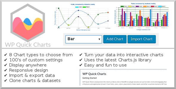
WordPress Quick Charts comes with 8 Chart types to choose from: Bar, Bubble, Doughnut, Horizontal Bar, Line, Pie, Polar Area & Radar. Ready to use without any coding skills with an intuitive user interface.
WordPress Quick Charts includes hundreds of options for customizing the display of your data in the various chart formats available.
Display charts on any page, post or custom post type, or any other area that accepts WordPress shortcodes, only your imagination is the limit.
Includes 8 Chart Types
Bar Charts
Bar charts are a simple and effective way of displaying various forms of data. Bar charts are sometimes used to show trend data, and the comparison of multiple data sets side by side.
Bubble Charts
A bubble chart is used to display three dimensions of data at the same time. The location of the bubble is determined by the first two dimensions and the corresponding horizontal and vertical axes. The third dimension is represented by the size of the individual bubbles. Bubble charts are often used to display financial data.
Doughnut Charts
Pie and Doughnut charts are probably the most commonly used charts there are. They are divided into segments, the arc of each segment shows the proportional value of each piece of data. They are excellent at showing the relational proportions between data.
Horizontal Bar Charts
Horizontal Bar charts are a simple and effective way of displaying various forms of data. Horizontal Bar charts are sometimes used to show trend data, and the comparison of multiple data sets side by side.
Line Charts
A line chart is a way of plotting data points on a line. Often, it is used to show trend data, and the comparison of two data sets.
Pie Charts
Pie and Doughnut charts are probably the most commonly used charts there are. They are divided into segments, the arc of each segment shows the proportional value of each piece of data. They are excellent at showing the relational proportions between data.
Polar Area Charts
Polar area charts are similar to Pie charts, but each segment has the same angle – the radius of the segment differs depending on the value. This type of chart is often useful when we want to show a comparison data similar to a Pie chart, but also show a scale of values for context.
Radar Charts
A radar chart is a way of showing multiple data points and the variation between them. They are often useful for comparing the points of two or more different data sets.


